User Experience Testing - Improve Conversions and Retention
The success of a product depends greatly on its User Experience (UX). Form follows function and even incoming traffic. For web products it often means, its UX holds key to its success.
Unfortunately, UX cannot be improved by simply following a series of fixed guidelines like page speed optimization, for example. You need to get inside your user's mind
- Why are they using your product
- How are they using your product
- What is it they like or hate about your product
For the success of a product you need to Identify the problems > Come up with a solution > Test your solution > Repeat!
Common User Experience Issues
While there are clear methodologies to identify server-side errors using various tools like New Relic or Sentry, you still miss out on -
- How these errors are impacting your UX?
- What about experience level issues that are non-erroneous?
UX issues are more subjective which makes them even harder to detect and label.
Thanks to technology, Browsee and some other tools can help you identify UX level issues. Browsee uses AI to determine subjective issues in your UX with an accuracy of more than 70%.
Some of the common UX issues impacting your users are -
- Expectation Mismatch
- Something Not Working or Slow
- Slow Response Time
- Slow Page Load
- JavaScript Errors
- Network Errors
- Broken Links
- Confusing Form Inputs
- Confusing Design
- No Clarity on What to Do
- Repeat Actions
If you feel a UX issue is benign, you can "Mark it as Resolved" which means please ignore these for future.
How do I Identify UX Issues with Browsee?
Not only can you watch session recordings of your users to have a better understanding of how they are using your product, what problems they are facing, and what they really like in your product.
If you are just starting up, you may have a limited number of sessions that you can watch. However, as you grow, the number of sessions grows which makes it impossible for you or your team to watch.
Browsee tags session recordings based on AI to give you pinpointed sessions to watch. For each of the UX issues stated above, we have built a tag. We mark all the problematic sessions with these tags at a specific timestamp.
Whenever a session gets a tag, you can immediately identify the problem by watching the session. With the mentioned timestamp, you may not even need to watch the whole session.
UX Issues and Tags
UX is not objective, where you can write some tests or ask your team to test. It is about how real users feel while using your product.
This makes session recordings an important part to improve UX. You can visually analyze the problems faced by your real users.
Here is how a typical session recording would look in Browsee
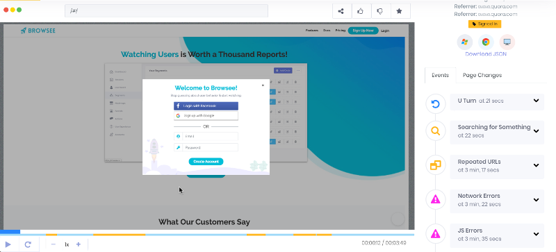
On the left, you can see the complete session of your user which is just like watching your user live, and on the right, you will get tags marked with timestamps. This will make your task easier, as you can exactly see which problem is faced by the user, at what time. You can directly reach to that time instead of watching the whole session which will save you time as well as avoid any confusion.
Let us dive in to common user issues that Browsee tags.
U Turn - Expectation Mismatch
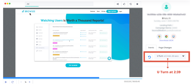
Browsee helps you identify any session where the user suddenly turns around for a page, likely due to an expectation mismatch.

The reasons for expectation mismatch could be -
- Sudden turnoff. Before clicking they thought they would end up on something different. For example, the link text might be confusing - they thought they would be reading about Disneyland but they end up on a page on LA which contains info on the Disneyland at the bottom.
- They did not like what they saw. An example could be sudden U-Turn on pricing page means pricing might be too high!.
You can find such sessions in Browsee by just using a filter of U-Turn:
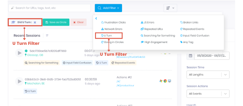
Exactly know where user took a U Turn
Frustration/Rage Click - Something Not Working or Slow
What is the most common behaviour of a user when a click does not work or is extremely slow in responding? Yes, you guessed it right - Rage or Frustration!

A common user behavior in such a scenario - Clicking multiple times on the same button or at the same element on the page.
Browsee tags all your sessions where a user was found to be clicking multiple times at a very small interval on the same element. This might happen in a session when -
- A click is not responding
- A click is too slow to respond
- The element looks clickable but it is not
You can identify such sessions in Browsee by applying Frustration Click Filter -
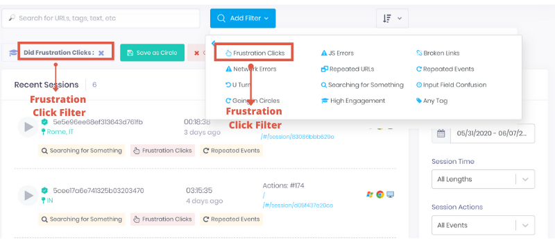
Exactly know which element is getting the frustration clicks -
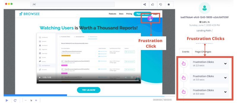
Looks like the signup button is not working! By watching sessions for frustration clicks, you can easily analyze if any of your buttons are not working or giving a slow response.
Network Slowness - Slow Response Time
Did you know a 1 Second delay can cost you up to 11% lesser page views, 7% lesser conversions, and 16% lesser customer satisfaction?
AJAX calls are quite commonly used for frontend development which updates a webpage without reloading the whole page. This is better as instead of the complete page only a part of the page gets updated. For example, your data tables are usually loaded with AJAX calls.
What happens when these AJAX calls are slow? It will hurt the user experience and if it takes too much time to load, users may leave without even waiting for the data to load!
It is important to understand the impact of slowness on your UX. Some calls are more important than others.
You can identify the impact of any AJAX slowness via Browsee -
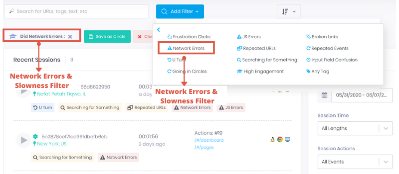
In Browsee, you exactly know which call took longer to respond, by watching the session you can see its impact on the UX and you can mark it resolved in case it is not impacting your UX.
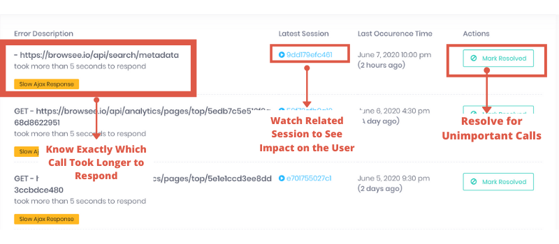
Not only you can identify the impact of slow AJAX calls, you can also see the impact of any AJAX errors. Sometimes, the errors are benign. For example, if there is an error while sending data to your analytics server, it will not impact your UX. In those cases, you can mark them as resolved and we will not mark such sessions further.
For sanity, Browsee does not provide any errors or slowness related to 3rd party tools like GA, etc.
Slow Page Load
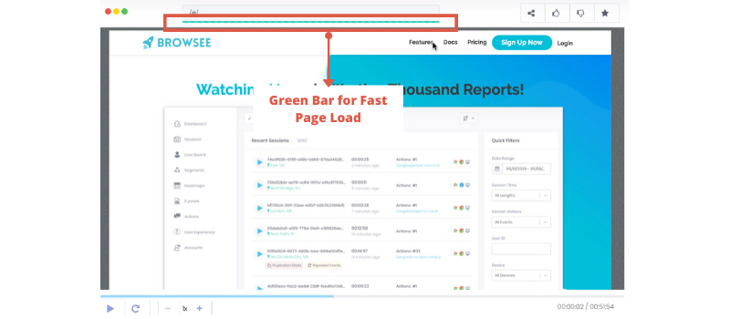
Browsee clearly shows the time taken by your pages to load. If it is taking longer, you need to reduce it as it will affect your UX and hence conversions.
Did you know 53% of mobile visitors leave a site if it takes more than 3 seconds to load (src: Google Study)
Once you go to any session, you will see a bar at the top which is color-coded -
- For extremely slow page load - Red, Do something!
- For medium speed page load - Yellow, Not too bad
- For fast page load - Green, Good
JavaScript Errors - Client Side Errors
From my experience, a lot of the JS errors are not fatal but when it is impactful, it can ruin the whole experience. So, it is important to know the impact of JS errors on your users and fix them as we find them.
In Browsee, you can easily identify the JS Errors and see the related sessions to prioritize your JS Errors fixing.
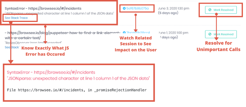
While watching the session recordings, you will be able to locate via timestamp the exact location of your error
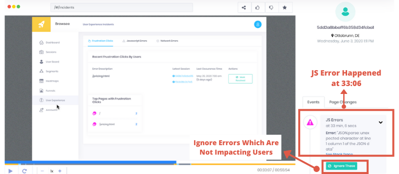
If you realize that the error has no impact on the users, you can also mark those to be ignored in the future sessions.
Broken Links - Page Not Found
If you click on one of the links and it gives you an error like "This Page Does Not Exist", such links are called as broken links. Often while writing content like a blog or the product documentations, we provide certain external links.
With time, some of these links are moved to some other URL or it gets removed and we start to get 404 or Page Doesn't Exists errors. If it goes unnoticed, these links spoil the user experience and also hurts the credibility of your product.

Broken Link is a client-side error which can occur:
- If a page has been removed
- If a page has been moved to some other URL and the link is not updated
- If a user typed in the wrong URL
Browsee alerts you whenever someone hits a broken link on your website via Email.
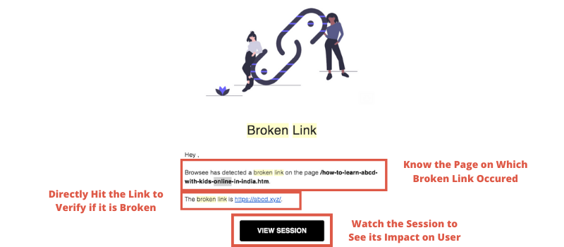
You can also filter the sessions for Broken links in Browsee
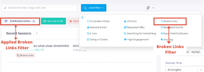
You will get an idea of how many of your users are encountering the broken links and also you can see those sessions to know if it has an impact on your overall experience.
Input Field Confusion - Confusing Form Fields
Browsee marks all the sessions where the user is spending disproportionate amount of time on a specific form field. You can easily identify those fields and see if you can simplify the field or is there any confusion regarding field name or placeholder.
Browsee has helped many customers in improving their forms. I specifically remember one incident where a customer told us how Browsee helped them. In one of their signup forms, users were asked for "Name/Email" and a lot of people started to write xxx@xxx.com/+001-XXXXX after spending quite some time on the field. They ended up changing the field name to clearly Name or Email.
High Input time could be because -
- Field name or placeholder is confusing
- Autocomplete is not giving the desired choice
- User need to dig information before filling the field
You can help the customer by auto-filling a few details if possible. We have seen that auto-filling a few details drastically increases the Conversion Rates up to 20% in several customers.
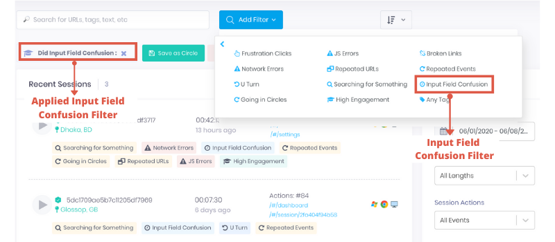
You can apply the filter for Input Field Confusion in Browsee to identify such sessions and you can directly watch them in order to understand what could be the problem.

Watching a couple of sessions helps you build a lot of intuition instead of just following the form analytics wherein it is hard to decode the reason for users dropping the forms. Stay a step ahead by watching these sessions than pondering why your users left the form in the middle!

Going in Circles - Confusing Design
Are you users doing a series of steps more than twice? Now, this could be a positive feature too. For example, a user is adding items to the cart and is circling in between product pages and cart page.
However, sometimes this triggers an alarm for poor UX. For example, we have seen this tag triggers for the products having poor Onboarding flow where the user keeps circling between the dashboard and a couple of features to understand what do you exactly do!
Another example for E-Commerce could be when the payment is not working and the user is circling between cart and payment pages to get done with it!
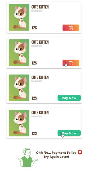
Browsee tags all sessions where users go in circles and you can watch them just to understand if there is an issue or if it is a common behavior.
Searching for Something - Losing Clarity
Another common problem in websites is that there is no clarity on what a user is expected to do. This is usually a problem faced by new users as they are not accustomed to your product and are still exploring the product.
Imagine someone entered in a disorganized clothing store and they have to search for socks. It would be really hard for them and they would end up running here and there to search for a pair of socks! Don't let your product be a disorganized store.

Your product should properly guide them on what to do so that they do not go between URLs haphazardly. Browsee tags sessions where a user is quickly going through URLs and looks a bit lost.
In Browsee, you can apply the "Searching for Something" tags to understand if your users are getting confused in any of the important flows like right after signup, first payment, etc.
Sometimes, the user just does not know what to do after landing on the page or after signing up for the product. You need to guide them via a properly designed and structured Onboarding flow.
Repeat Events
We also mark sessions where the user is doing the same action as clicking on a button again and again. Then how is it different from Frustration Clicks? Frustration click is repeatedly clicking on the same element at quick intervals. However, Repeated Events are repeated clicks with no hard time-bound but the user is found to be clicking on the same page element again and again!
Iterate and Improve
Watching session recordings helps you in improving the product as you can exactly see what your user saw! Here are a few -
- You can build a better intuition around why users are leaving your product or what they love about your product
- You can quickly identify problems in UX which is much harder to point in team discussions or large meetings
- You feel more connected to your user as it is just like watching your user live

- There can not be any debate on whether the problem exists or not (between testing team and developers, you will always have a proof)

If you have liked the article and wish to nail your user experience and optimize your website, I would recommend installing Browsee on your website.
If you need any help, you can directly reach to us at contact@heroteck.com.
Ciao!
How much is a great User Experience worth to you?
Browsee helps you understand your user's behaviour on your site. It's the next best thing to talking to them.


