Top 10 User Onboarding Styles in 2020
Onboarding is the process of "Getting Started" of your new users. Absence of a proper Onboarding scheme will lead to Higher Churn.
Onboarding involved defining a series of steps by product owners that helps new users to get accustomed to the product. It also helps you drive the initial engagement of the new users.
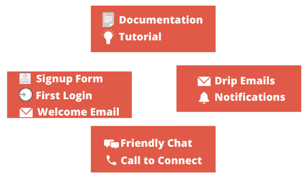
A few fundamental blocks of your Onboarding scheme are -
- First touchpoints - Involves Signup Form, Welcome Email, or First Login/ Welcome Screen.
- Help - Documentation and Tutorials (could be text, audio, or video - depends on whatever format suits the product).
- Guide - Educational Emails via Drip for useful features and In-Product Notifications for relevant or new features to guide them.
- ChitChat - Online Chat or Asking for a Callback in case a user seems stuck works pretty well for initial users.
In this article, we will focus on first touchpoints which involves first login and welcome email.
10 Exemplary Onboarding Designs from Top SaaS tools
We will include here onboarding and welcome screens for new users from the top 10 SaaS tools. You can get inspiration from their ideas, designs, language, etc, and optimize your onboarding flows.
#1: Notion's Onboarding and Welcome Screen
Notion is your all in one platform for all your work apps like docs, excel, task management and knowledge-base which are typically used in collaboration
Notion has a 2-step onboarding process.
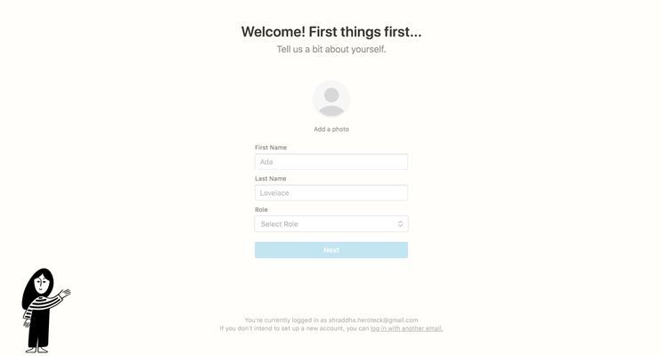
In the first screen, they ask for personal information like Name and Role.
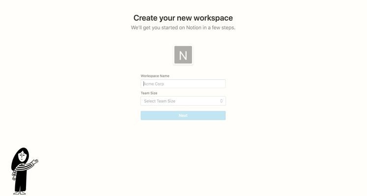
In the second screen, they ask for a name for the workspace and the team size.
The design for Notion is very simple and the color palette is mostly black and white. Their onboarding questions are relevant for their welcome screen. Based on your role and team size, they show you different templates for project work.
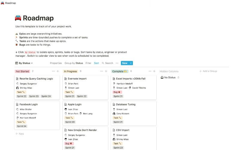
You can further take inspiration from Notion's designs from here.
#2: Amplitude
Amplitude is an event-based analytics tool that gives you comprehensive analytics across your web and app users.
Amplitude has a simple signup screen that takes you to a dashboard populated with fake data.
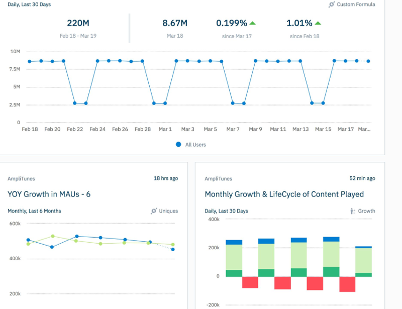
You can try out any of their features which are populated with fake data to dive you a better understanding of how their product works and looks.
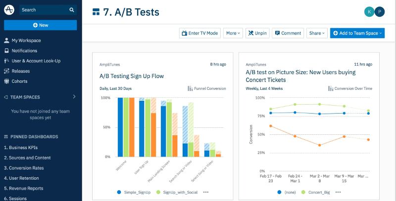
You can further take inspiration from Amplitude's designs from here.
#3: Browsee
Browsee is a tool to optimize the User Experience of your website.
You need to install Browsee's JS snippet before getting any data on your dashboard. Hence, they show a modal with multiple integration options which you can use for integrating their JS snippet.
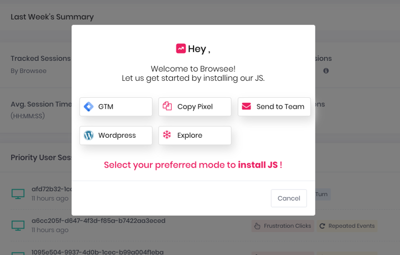
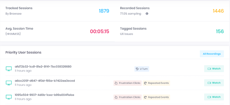
Also, if you choose to cancel the modal, they show a dashboard populated with fake data. This helps new users to get a look and feel around their product.
#4: Evernote
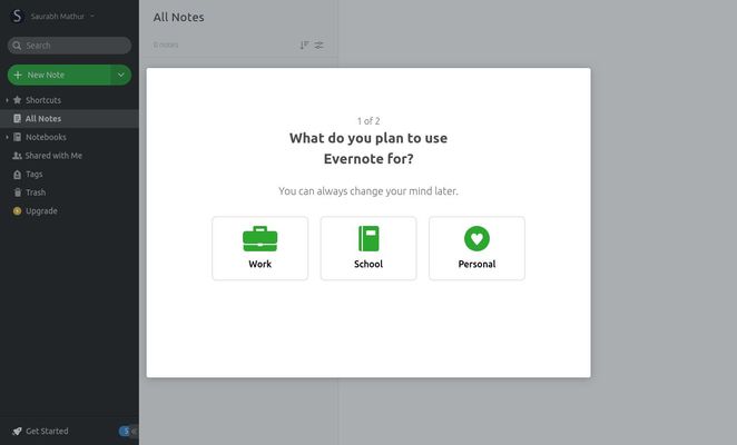
Evernote is a note-taking app that helps you organize your thoughts across multiple devices. Evernote has simple 2 step onboarding scheme
In the first step, they ask for your professional background
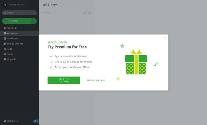
The second step is to intimate you that you can try their premium plan is free for the next 7 days.
You can further take inspiration from Evernote's designs from here.
#5: HelloBar
Hellobar is a tool to help you create popups and widgets for your website for lead capture and other marketing use cases.
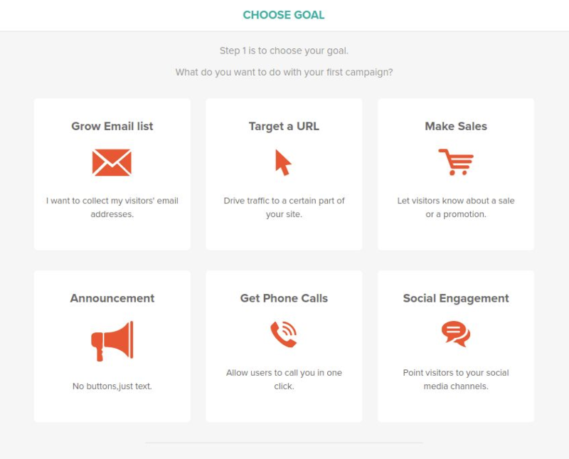
In the onboarding, they ask for your goal
and for the notification type that you wish to create
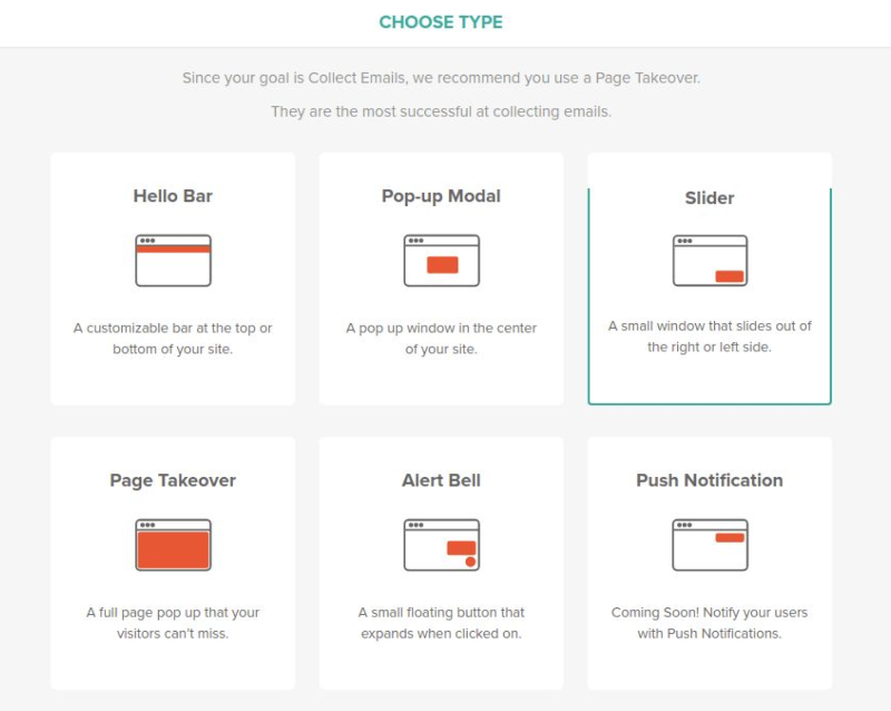
Hellobar involves a JS integration before you can show a popup on your website. So, in the onboarding, they prompt you for the JS snippet integration.
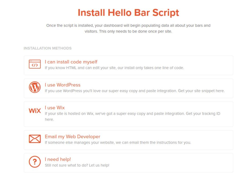
You can further take inspiration from HelloBar's designs from here.
#6: Airtable
Airtable is a combination of spreadsheet and relational databases which has features and flexibilities just like a database but as easy to use as a spreadsheet.
Airtable has a simple onboarding flow asking for what you are going to use Airtable for. Also, on the right, they tell you about their 14-day free trial plan with the detailed features which you could use during the free trial.
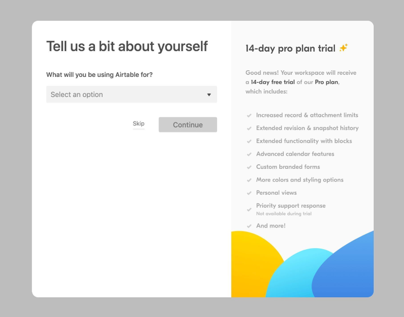
You can further take inspiration from HelloBar's designs from here.
#7: Basecamp
Basecamp is an all in one toolkit for project management and team communication.
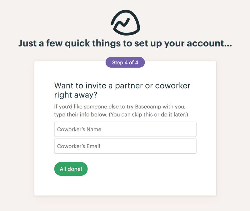
Basecamp has a pretty exhaustive onboarding scheme, where they ask for
- Company name and your role in the company
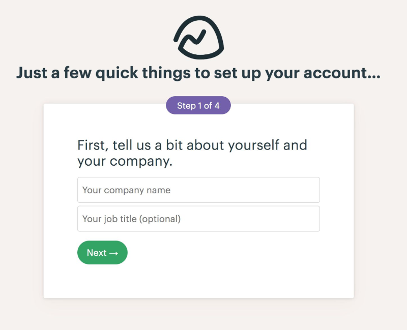
2. Then, they ask for various teams in your company
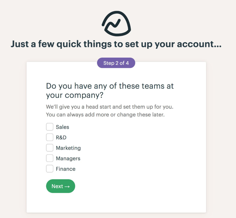
3. Next, you can tell if you already have a project in mind or you can just move on
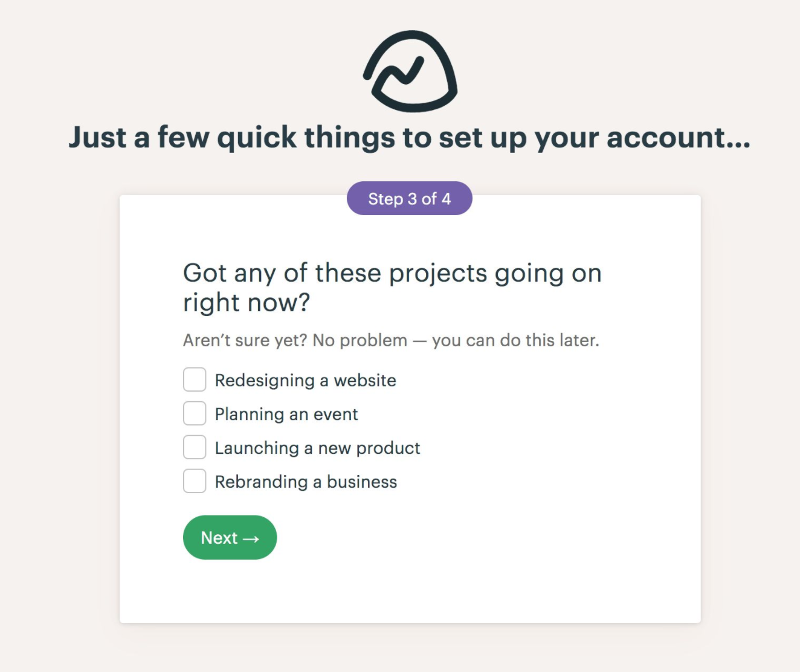
4. Then, they ask to invite a few team members on the go!
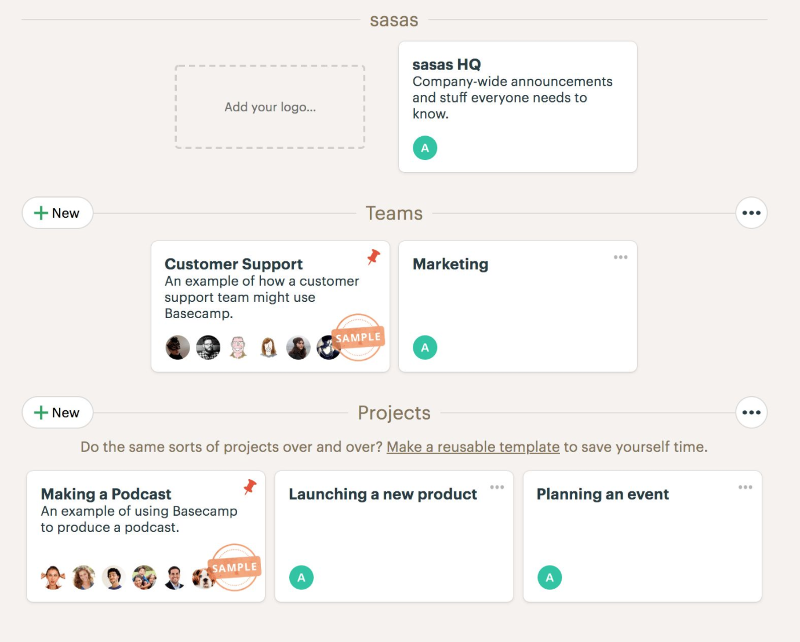
Based on your inputs, they personalize a bit of your dashboard.
You can further take inspiration from BaseCamp's designs from here.
#8: Datadog
Datadog is a monitoring and alerting tool for an application, database, individual services, and servers.
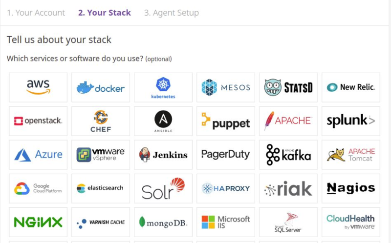
Datadog has a detailed onboarding process. As they monitor the alerts on you application, DB, and servers, you need a specific type of integration. Hence, Onboarding plays an important role where they ask for the stack and platform. Based on your inputs, they tell you how you can install Datadog with your application or server.
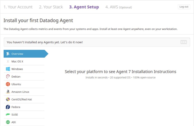
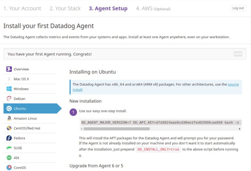
You can further take inspiration from BaseCamp's designs from here.
#9: Calendly
Calendly gives you a simple and elegant way to schedule your meetings without having to do a to and fro conversations on an email or chat.
Calendaly has a 3 step onboarding process. In the first step, they ask for a URL path that is identifiable as a person or a business.
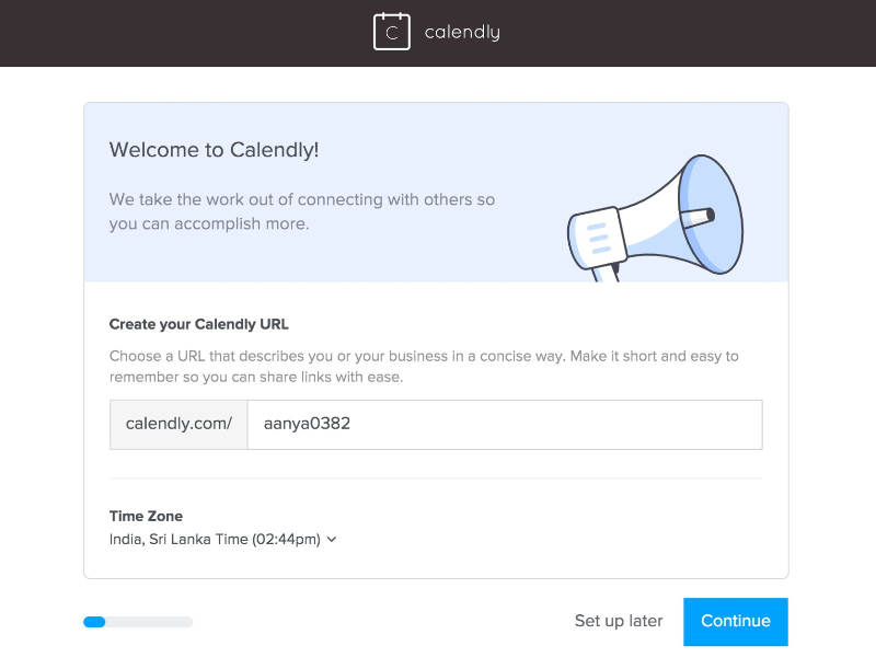
In the second step, they ask for your calendar integration like Google Calendar or Office 365 Calendar to check for your availability.
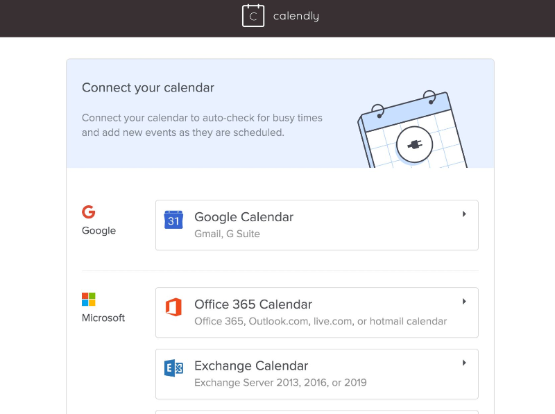
In addition, they also ask for your availability for weekdays which would help them to propose a meeting time to others.
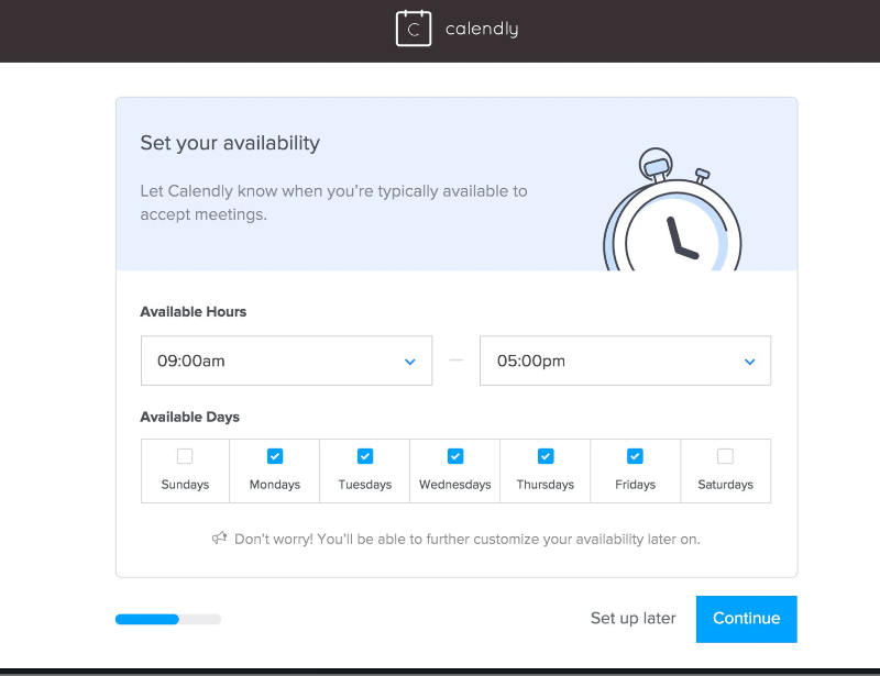
You can further take inspiration from Calendaly's designs from here.
#10: Zapier
Zapier lets you connect various applications together. It basically builds connectors for each application which can then be linked to perform certain tasks like sending a mail in Gmail to a Google spreadsheet.
Zapier has a 2 step onboarding process where they ask for the role and the apps you use to personalize your experience.
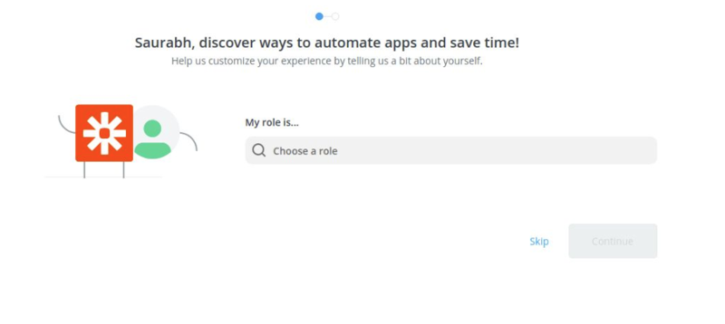
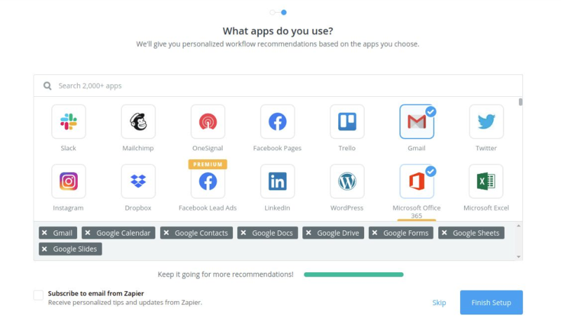
You can further take inspiration from Zapier's designs from here.
If you have liked the article and wish to optimize your Onboarding experience and Engagement, I would recommend installing Browsee on your website.
If you need any help, you can directly reach to us at contact@heroteck.com.
Ciao!
How much is a great User Experience worth to you?
Browsee helps you understand your user's behaviour on your site. It's the next best thing to talking to them.


