A Complete Guide to Heatmaps
Kaizen is a Japanese word that means “continual improvement”. As a product owner, we use Kaizen Methodology that involves making changes in our pages, monitoring results, and re-adjusting the page .
There are times when we push for better engagement on content pages and times when we try to get more conversions on our landing pages.
How do you know what to change on your pages? Wouldn't it be great if someone just walks in and tells you what exactly is not working on your page? But, what are the odds?
However, heatmaps give you data-driven visual insights on your pages. It is just like someone walks in your life and tells you what exactly is working and what isn't.

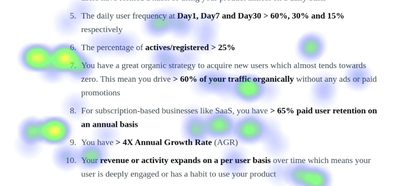
Honestly, heatmaps are one of the best tools in a product owner's arsenal.
What is Heatmap?
A website heatmap is an aggregated visual representation of users' mouse activities. It is a color-coded version of the data collected from users' activities.
Imagine the amount of data collected from the mouse activities of all your users. Representing it just in numbers will make it impossible to read with a human eye.
Color coding in heatmaps makes it human friendly. It will show high activity areas as red (imitating hotness) and low activity areas as blue (imitating coldness).
Heatmaps are used in a variety of fields like in seismic activity graphs in Seismology or aggregated user activity plots in website analytics.
Analytics tools give you a great hold on what is happening on your website or pages. You can see the number of unique users, unique sessions, time spent, how they are changing over time, and much more.
However, some times watching numbers does not help you in building intuition. You know that there is a significant drop at a step in your funnel but you can not figure out the "WHY" on your own.
For example, a typical question from website owners across the world is
Why my E-commerce site is not producing the sales I expected or Why my SaaS Homepage is not giving me enough signups?
This is one of the most common queries from founders across social media platforms like Reddit, Quora, and IndieHackers.
Your analytics tool told you about a high bounce rate, poor goal conversions, steep drops in your funnels, etc. Your unanswered questions are -
- Why is my conversion rate low?
- What is missing on the page?
- Where are people spending most of their time on?
- Why they left without buying or signing up?
Color coding of Heatmaps

Traditional color coding in heatmaps -
Bluerepresents cold implying low activityGreenrepresents moderate implying medium activityRedrepresents hot implying high activity
You should aim for a red color on your primary CTA's.
However, a red-colored cross/dismiss button represents, users do not want to interact with that UI element and should be addressed.
A good conversion rate starts with a good and engaging page.
What are the types of Heatmaps?
Heatmaps are an aggregated visual representation of mouse activity data collected from the users. Mouse activity includes
- Clicking
- Scrolling - Going upwards and downwards
- Reading - Going left and right (without moving up and down)
Based on the mouse activities, we have three types of heatmaps depicting users' mouse movements on an aggregated level.
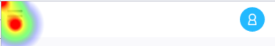
#1: Click maps
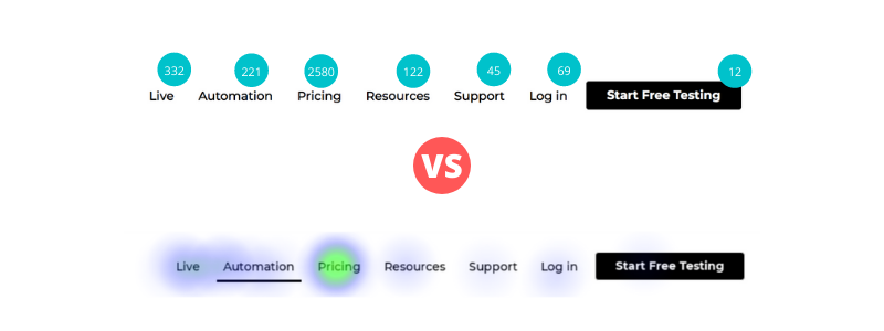
Click maps are a visual representation of aggregated clicks data from your visitors. You will get a visual summary of your highest and lowest clicked elements. It gives you an overall click distribution on your page.
Sometimes, you will get the clicks on the elements which are not clickable. This could either mean confused clicks also known as dead clicks or high engagement with the section.
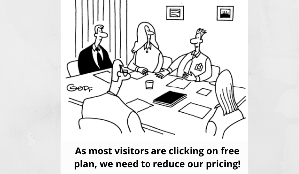
We can clearly see that pricing is one of the biggest interest areas for our visitors as we can see a huge number of clicks around pricing (making it almost invisible :D)
The advantage of click heatmap is
- Quickly visual analysis on where people are clicking the most
- Easy to understand as it is overlaid over your page
- Easy comparison between buttons and elements to gauge the visitors' interest
#2: Scroll maps
A Scroll Map helps you to analyze the average scroll depth of your visitors. You get a cumulative summary on what percentage of your visitors are reaching to a certain depth of your page.
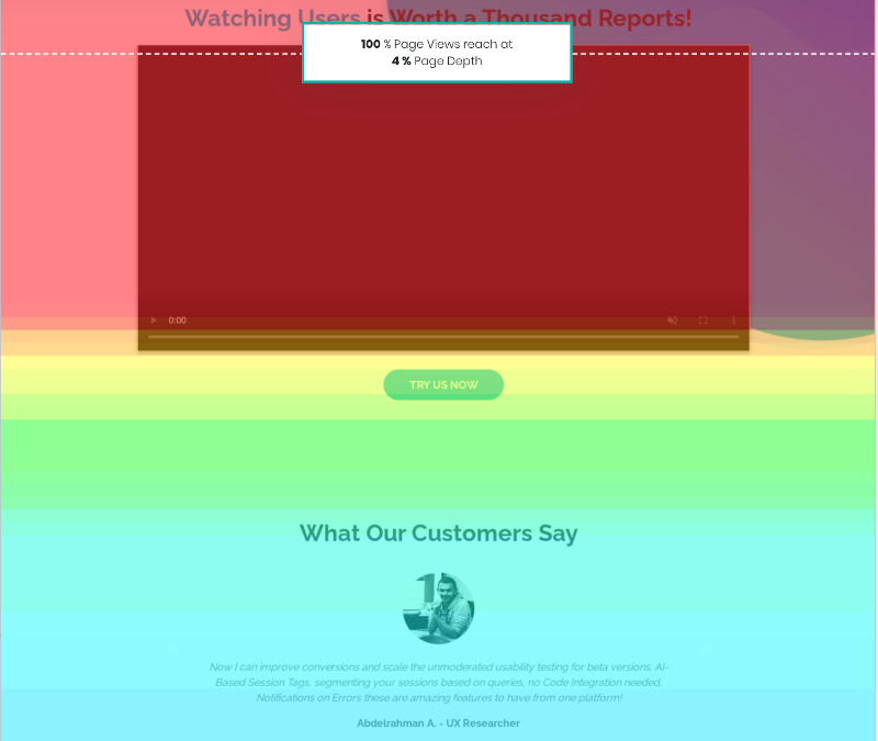
Scroll Map helps you to identify -
- If above the fold section in engaging enough for people to scroll down
- If your content is getting dull beyond a certain point
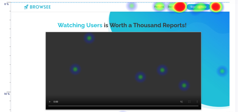
#3: Attention maps
An attention map gives you an idea on the most and least engaging sections of your page. You can visually identify where visitors are spending most of their time.
Attention Map helps you to understand -
- If above fold section is engaging or not
- If a particular section has a higher engagement
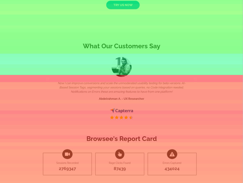
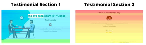
Interestingly, with the combined analysis of scroll and attention maps, you can re-structure your page for higher engagement. For example, in our case, customer testimonial and report card section has a much higher engagement than the section above. This suggests that moving these sections above will improve the overall engagement.
How Heatmaps helped me as a blogger?
Heatmap tells you the true side of your page engagement story, what analytics data does not tell you!
A few days back, my blog was published on Reddit, HN and Zest.
What did I learn from individual publishing platforms?
Hmm, Good!
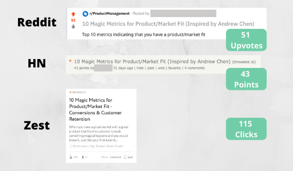
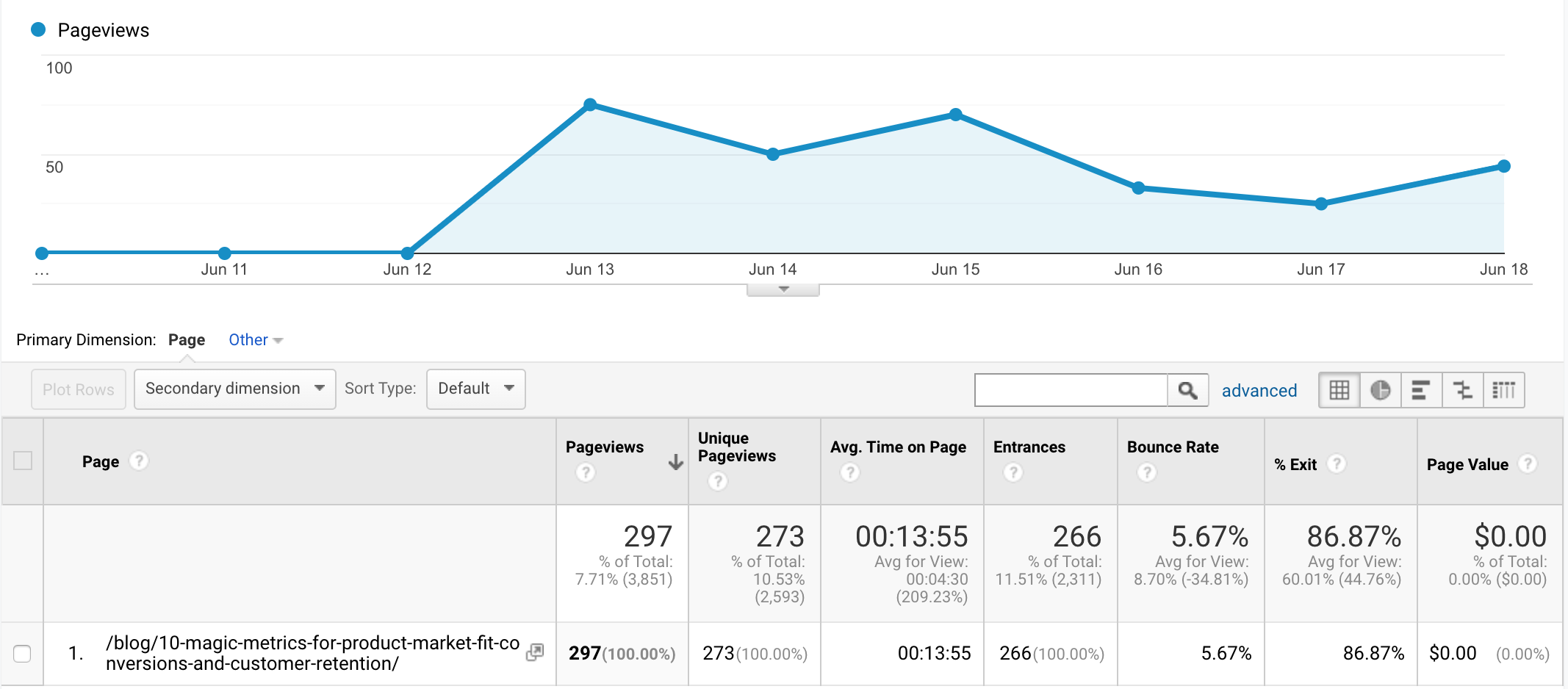
What did I learn from Google Analytics?
Oh, Not so bad!
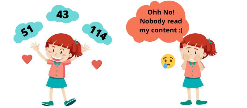
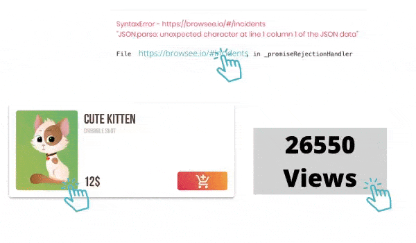
What did I learn from Scroll Maps in Browsee?
Ohh No! What happened?
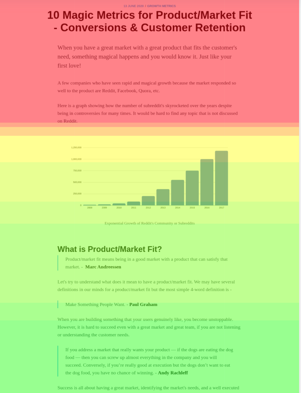
What happened to me in a moment
What insights can I draw from Heatmaps
Heatmaps are great to draw insights about your overall page engagement as well as engagement on individual element of the page.
A few insights that can be inferred quickly and effortlessly -
From Click Maps
- Identify Dead Click Elements - You can identify any non-clickable element that users are trying to click on your page. Sometimes, an image or a text color or a boundary makes an element looks clickable that could be misleading for your users.
- Header Links Importance - We all know the cost of prime real estate on the page like header bar, above the fold section, etc. It is important to understand the relevance of the individual link in your header bar. Click map shows the most clicked and the least clicked elements of your header bar visually. You can also visually see the
performance of CTAand decide on language or color i.e. yourA/B testing params.
- Identify Ignored CTAs - Visually identify if any important CTA is getting ignored as it does not look clickable or it is not getting enough attention. Usually help a lot for mobile responsive websites.
- Know What Interests Your Users - If users are interested in something, they randomly click here and there while reading it. It is a sign of engagement. If a part of the page is getting too many random clicks that indicate it interests your users.
From Scroll Maps
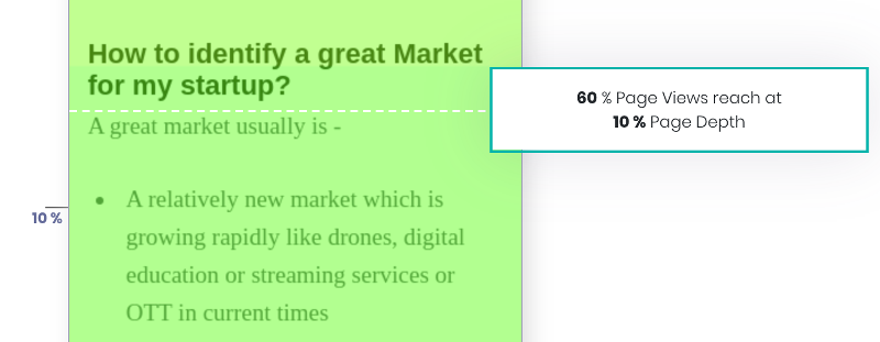
- Know Where Users are Losing Interest - Especially useful for long-form content like big articles, blogs, product details page, etc. You immediately know when your users are losing interest in terms of page depth. For example, you certainly know which part of the page needs to be fixed if a scroll map indicates
90%of your users are getting dropped without scrolling for10%of the page.
- Move Key Content Pieces Upwards - Helps you in identifying if you are losing your users before they strike a key piece of information or a key CTA. By moving the content or CTA upwards will improve the engagement or conversions!
- How Long Content Should be - You page is probably too verbose if a scroll map for a content page suggests an extremely low reach at the bottom of the page. It helps you in identifying a good length for your articles.
From Attention Maps
- Know Which Section Drives Better Engagement - An attention map shows which sections are getting better engagement in terms of average time spent by users. A section with higher engagement could be moved upwards or vice versa based on the attention map.
- Compare Engagement After a Change - Know the impact of your changes by comparing the two attention maps prior and following to changes. For example, replacing company logos with real user images in the testimonial section significantly improved the engagement of the testimonial section.
How to Create Heatmap?
Building heatmaps for website analytics is easy. You can use 3rd-party tools like Browsee to create heatmaps for your important pages.
You can create heatmaps for
- Single URL - When you wish to analyze your important pages like Home Page, Pricing Page, Dashboard, etc.
- URL Pattern - When you wish to analyze a group of similar-looking pages like product pages in E-commerce or property pages in real-estate. All these pages are built with the same template however each page has different data like Image, Heading, Description, etc.
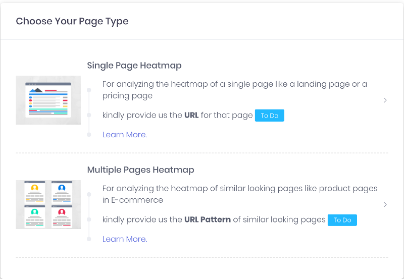
In addition, Browsee gives you single-click heatmap creation by listing all your high traffic pages.
Learn more about how to create heatmaps in Browsee from here.
Improve your pages with Heatmaps?
Heatmaps make it easier for anyone to analyze user engagement on your pages. It represents humungous user activity data in a human-readable format. It becomes easy via Heatmaps to understand where people are clicking, up to what depth they are scrolling, or what caught their attention.
Let's see how you can use these insights to your advantage by improving engagement and driving more conversions.
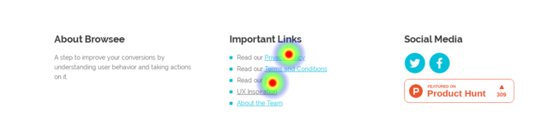
- Improve page using click distribution - On our pricing page, we saw a lot of clicks were happening on the Privacy Policy. Hence, we knew it is important to cater privacy terms upfront and we added a FAQ section for the same.
- Improve page using scroll depth and user attention - We moved our testimonial section upwards using insights from scroll and attention maps. Our attention map suggested that we have great engagement on the testimonial section however our scroll map showed a low percentage of visitors reaching on that section. Moving it upwards improved our page engagement significantly.
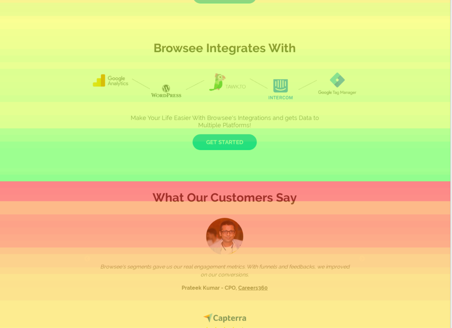
- Improve page using attention map - "A Little Goes a Long Way". It is amazing how small changes on your page can improve user engagement. We used to have customer logos in our testimonial section but while a revamp we replaced customer logos with the Linkedin images of our users. This significantly improved the attention of our visitors.

Heatmaps real-life use cases for product marketers and product managers
Heatmaps certainly helps you in many ways -
- Pointers on A/B Testing - How do you currently decide what to change in a page while running an A/B test. Does it come from a personal instinct or a group discussion that is purely random? A better and more data-driven approach could be by analyzing the heatmaps. Heatmaps guide you on what is working and what is not working on your page. You could then change the color, position, language, font, or size of a CTA or other page elements/sections.
- Compare Page Changes - Our team keeps updating the important pages driving conversions. The difference in the final number of conversions is one way to judge the performance of a page change. Another interesting analysis can be done via comparative heatmaps for judging page engagement. Browsee gives you continuous data recording for heatmaps where you can compare the heatmap for a page in two different time windows. You can see vis-a-vis how your changes are performing in terms of clicks, scroll, and attention.
- Page Restructuring - As mentioned earlier, we can also derive if a section should be moved upwards or downwards based on the combined analysis of the scroll and attention map.
- Appear Smarter in Meetings - Are you responsible for the performance management of a landing page or SaaS home page? Appear more data-driven and smarter in meetings with Heatmaps ;)
If you have liked the article and wish to optimize your pages for better conversions and engagement, I would recommend installing Browsee on your website.
If you need any help, you can directly reach to us at contact@heroteck.com.
Ciao!
How much is a great User Experience worth to you?
Browsee helps you understand your user's behaviour on your site. It's the next best thing to talking to them.

