Landing Page Design – Best practices for a perfect and high converting page
Landing pages now has become one of the key ingredients of modern digital marketing strategies and ad campaigns. It is the gateway to the visitor’s mind to becoming a customer of your brand. Landing pages usually are standalone pages, which is distinct from your website’s homepage, and serves the purpose of lead generation or sales generation. Basically there are two types of landing pages, click through landing pages- which as the name suggest leads the visitor’s to another page on your website such as our e-commerce site and Lead generation landing pages- which typically offers the visitor’s something like a special offer, an e-book, a free trial of your product, etc in return for the visitor’s contact information. So essentially, a landing page lets you sell your products or gather potential leads from the contact information.
All that being said about landing pages, the ultimate job of a landing page is to convince a visitor who lands on your page, and making him take a decision to be your customer. This is a reason why marketing specialists advise maintaining a landing page. It lets you have a specifically designed page for gaining customer’s attention by focusing on the details you want. The home page of your website is not exactly designed for this purpose, often cluttered with a lot of information and details and might not be capable enough to convince a first time visitor. Landing pages on the other hand are more focused on its ultimate goal – that is winning the visitor’s mind. Hence marketing experts nowadays suggest that you maintain multiple landing pages, targeted towards segmented customer populations.
While, the ultimate goal of a landing page is to convince a customer, as a marketer your goal of designing a landing page is maximum conversion rate. Conversion rates are the percentage of visitors to your landing page that complete its desired goal- be it sales or lead generation, out of the total number of visitors to the landing page. The more effective is your landing page in winning visitor’s minds, higher will be your conversion rates. The process of optimizing your landing pages for high conversions is called landing page conversion. We recommend reading our articles on ‘An Introduction to Landing Pages and Landing Page Optimization’ and ‘Landing Page Optimization Process- Complete Step by Step Guide’ also to have an idea of the different types of landing pages, its elements and the entire process.
So, how can you design an effective and high converting landing page? This is a very crucial question everyone asks. But sadly, there are no standard rules or a guide for creating a landing page. This is mainly because landing pages are of different types with each one having different goals, products to offer, different focus group, etc. Creative an effective landing page involves much more than simply designing something that looks good. It involves a lot of science and psychological factors related to what your customer really wants. These factors depends varies for each landing page. So, there is no foolproof method for designing a landing page. But here we are trying to provide you something closest to it- a few tips that could help you with your landing page design and helps you gain customer’s attention. These are the major check points you need to factor while designing a landing page.
1. Nail it with a killer headline:
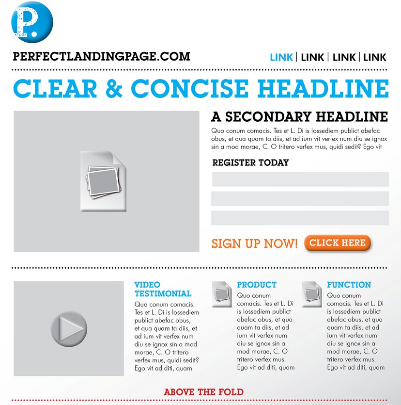
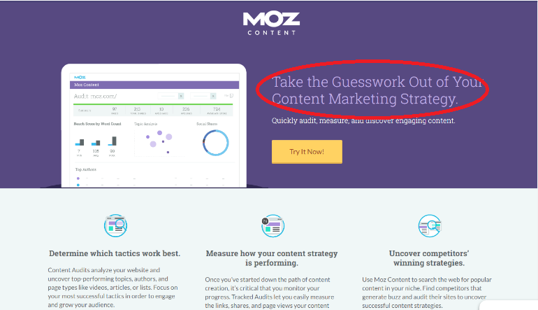
Ensure that the primary headline of your landing page is good and clear enough to gain the visitor’s attention. It should match the visitor’s expectation of the advertisement that he/she clicked to get to your page. This means the landing page headline and advertisement should complement each other. Remember heading is one of the first things your visitor sees. It should not be confusing or boring, but clear, concise and interesting enough to compel a visitor to take a closer look as in the example below.
2. Include a persuasive subheading which makes the customer stay on the page
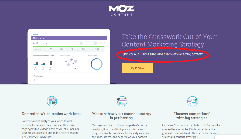
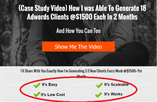
The subheading, which is usually just placed under your main heading, should go into more depth of your product and should detail the main headline. It is good to have an element of persuasiveness in your sub heading to encourage the customers. In the below example, the sub-heading explains the heading by telling how it is done.
3. Make your Call to Action bold and visible
Call to Action (CTA) is one if the important elements of your landing page. It is this CTA that converts your visitor to a customer. So ensure your CTA is highly visible to the visitor and is clear.
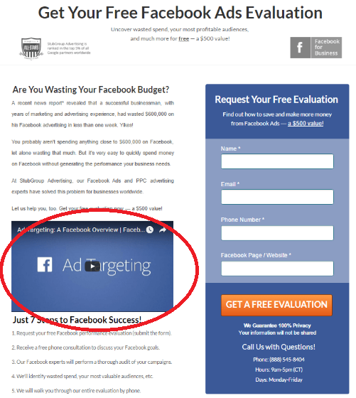
4. Include visual content like images and videos which are attention grabbers
As you all know, human brain processes visuals faster than simple text. So make use of this and relevant images and videos have great potential to shape your visitor’s impression of your brand.
5. Be concise in presenting your explanation and benefits and value proposition
The content should be clear enough, short and focused. The benefits should be clearly focused on the user and should answer the question- “what’s in it for me?” Your explanation and benefits need not be standalone elements always. It could be spread among other elements on the page. In the below example the text next to the checkmarks explains the benefits quickly.
6. Try to use bullet points or numbered lists wherever possible
Bullet points/numbering always makes it easier for the users to scan through the entire information rapidly and gather all the details. This makes the visitor stay on the page rather than having a long paragraph with all the information. Visitors to your landing page might not often take the pain to read a long paragraph.
7. Present all the information on your landing page in a structured and formatted manner
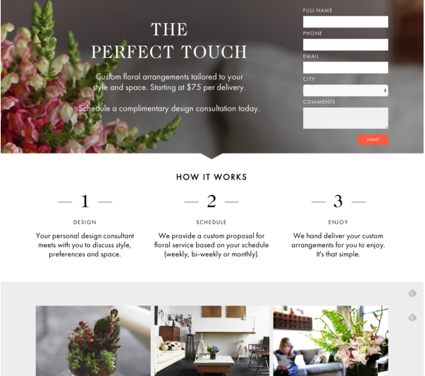
Presenting all the information you want to include in your page a clear and logical structure. Formatting is very critical to make your landing pages look good aesthetically. Placing your headline, sub headline, images, forms, etc aptly should create a visual friendly user experience that guides the visitors to complete the conversion. The sequence of presenting the information does matter- especially for long landing pages. Place the key points or most important elements above the fold (before you have to scroll down). Consider the below landing page of H.Bloom, a floral arrangement company, the page looks so well structured and beautiful with relevant and attractive images and an above the fold form. They also have a small and simple explanation of what they offer and description of ‘how it works?’ in 3 simple steps that makes the visitor attracted to their service.
8. Use contrasting colors for elements you want to pop off on your landing page
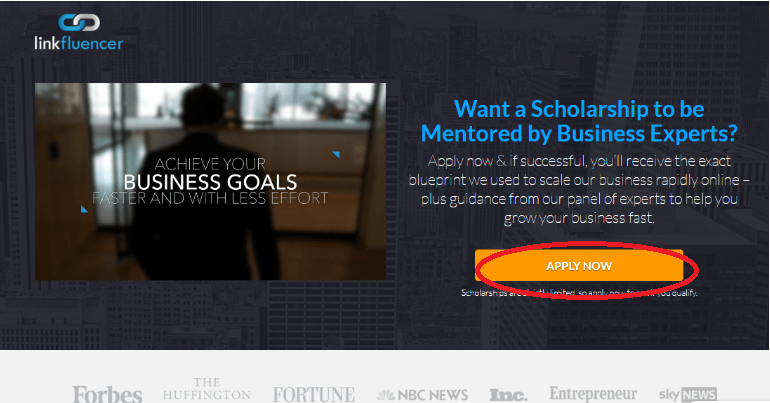
Using contrast colors for your CTA button is very important to grab customer attention. The landing page below has a CTA button in contrasting color and anyone who sees the page will not miss it.
9. Include social proof as the trust signals to your visitors
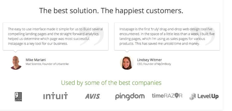
The social proof could be testimonials from your real customers or tweets or facebook messages from your users. For testimonials make sure you use pictures of your customers as it is a keystone of trust in testimonials. Testimonials and user feedbacks backed by real numbers and real data (like the number of people who has downloaded your product already) helps your brand gain user’s trust. The below landing page has a perfect social with a couple of testimonials and the list of companies using their solution.
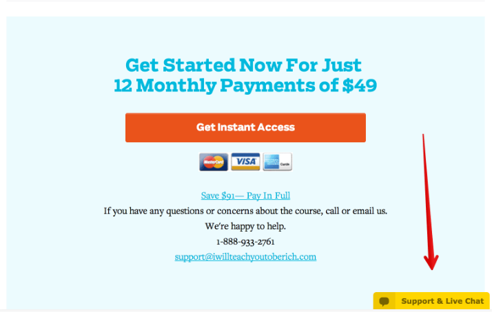
10. It is a good practice to give methods of contact on your landing page
This really helps in building customer trust at the most basic level- it provides assurance that you are a real company. You could give multiple methods – phone number, email, physical address or even a contact form to reach out to you. Some landing pages even have live chat options. The below example is a simple landing page which gives multiple contact options. It shows they are ready to clarify any of your concerns and thus helps in building customer trust.
11. Keep the number of links on the page minimum
This is important to reduce the distraction level on your landing page. Remove the excess links and use only minimum links.
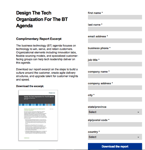
12. Design your forms such that you don’t ask for too much information
Forms that ask for too many details might force a customer to leave your page as he might not be willing to share or the details. Keep your form short and ask for only minimum details which are of value to you. For example, if you are doing only online marketing, it is not necessary to get the visitor’s physical address or phone number. Consider the below landing page. The form looks way too long for a free report landing page and all fields are mandatory too which adds friction to the page.
13. Choose the colors for your landing page wisely
Choice of colors for designing your landing page are capable to entice your visitors. They help in setting the mood of the landing page design and can even influence the user’s actions. For example Red, Orange and Yellow are considered to be attention grabber colors and can be used for your CTA buttons. Cool colors like blue and green looks appealing to your eyes, creates a sensation of security and trust, and are used by most of the businesses like banks, finance, entertainments websites, etc. Pink is often thought to be feminine and widely used in products and services for women.
That was some best practices which would help you in designing high converting landing pages. There is no ‘one size fits all’ solution for designing landing pages and each landing page might need different strategies to attract customers. But these are some general things that should be taken care while designing a page to bring in conversions which might not turn up if not taken care of. Keep A/B testing your designs to find the most converting page and do continuous optimization for even higher conversions. That is the ultimate way to get best landing page design. Hope the article helps!
How much is a great User Experience worth to you?
Browsee helps you understand your user's behaviour on your site. It's the next best thing to talking to them.

