Rage Clicks - A User Experience Issue
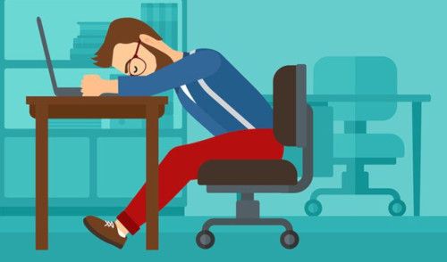
We have all rage clicked at one point or another. Rage Clicksor Frustration Clicks are generated when a user repeatedly clicks on your website, usually in response to a button or a link that is not responding as per the user's expectation, causing an intense emotional state of rage or annoyance.
"Your most unhappy customers are the greatest source of learning". - Bill Gates
The reality is every frustrated customer does not come back to report an issue. In fact, a study shows that only 1% of your frustrated users come back to raise support requests. So, it is important to keep a check on your User Experience and make it flawless.
How should you keep a check on User Experience? Session replay technologies like Browsee make it possible. It is as good as seeing your user live in front of your eyes. In fact, its better than supervised usability studies as its well know that users perform differently under supervision.
Session Replays also help you capture rage clicks. As per human psychology, if a button is irresponsive, users try to click it 2-3 times to make sure that the click actually happened. Browsee captures such behavior and marks them as Rage Click.
Rage Click Examples
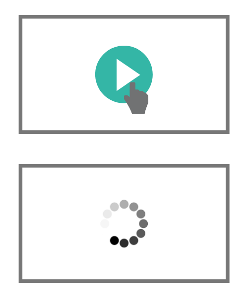
- Slow Responses with Unclear Messaging: Slow responses accompanied by unclear messaging often cause rage clicks. You click a button and nothing happens. No loading message, no response instantly cause the users to rage and they keep pushing the button again. Ensure you have a proper loading message in case of slower response time.
- Misleading Texts or Dead Clicks: Sometimes, people write text and make a boundary or underline it in order to increase visibility. This can be misleading to users and they assume it to be clickable and when a click does not work, they tend to click it multiple times.

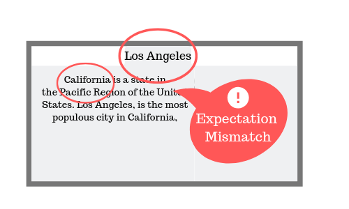
- Expectation Mismatch: If your content does not match with what was promised, then user tends to click haphazardly. An example is when text written on tabs does not exactly match with the content.
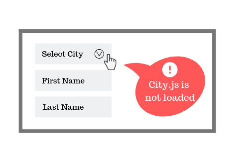
- Client Side Errors: Rage Clicks are also result of a client side JS error which results in non-interactivity of the UI. For example, if you have a city dropdown and its JS did not load for some reasons, then you will see a frustration click on the select menu.
- Unclear Error Messages: This usually happens in forms. If a form has a validation check but the error message is not visible, it is hard for user to decode what went wrong and it leads to rage clicks.
Creating False Alarms
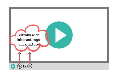
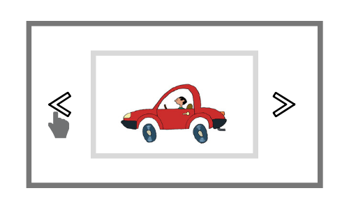
There can also be false alarms among Rage Clicks because of the inherent nature of the button. Here are a couple of examples which shows how Rage Clicks can be false positives:
- Multiple Times Clickable Buttons: Like Zoom and Volume buttons
- Image Sliders: Requires user to repeatedly click on an area
How to use Browsee to Find Rage Clicks
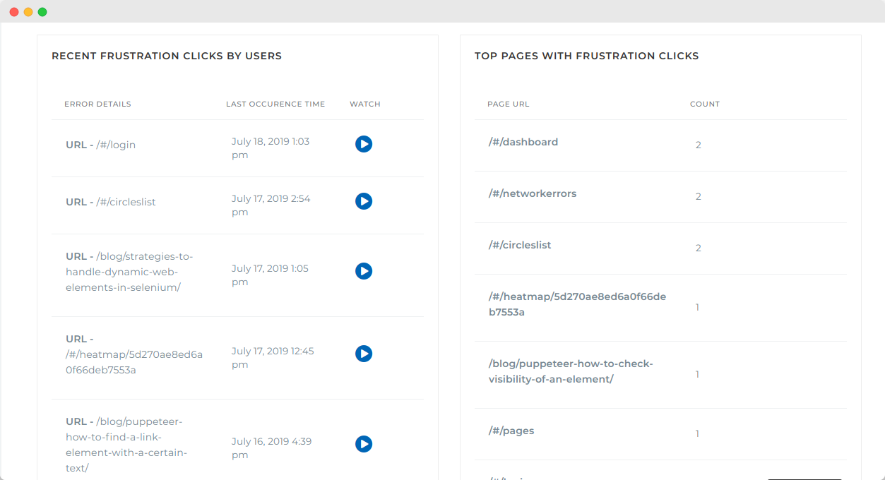
Browsee filters all the sessions where user is found to be clicking frantically somewhere on your website. We make it easy to find frustrated users for you. You can login to Browsee and go to 'Click Analysis' tab from the left panel. Here, you will find a list of sessions with Rage Clicks as well as the pages where maximum Rage Clicks are registered on your website.
Hope this helps you resolve usability issues faster and make your product frustration free.
How much is a great User Experience worth to you?
Browsee helps you understand your user's behaviour on your site. It's the next best thing to talking to them.


