Landing Pages - 13 Key Insights on How to Get More Conversions
Not getting enough conversions from your landing pages? Thinking of hiring an agency? Wait! Here are a few pointers to get you started on better conversions.
If you are a software company - you probably have a landing page.
If you have a landing page - You are also trying to drive conversions from it.
A niggling question in every marketer's mind - "How does my page convert compared to competitors?" or "Why is my page not converting at all?" or "Have I achieved a perfect conversion or is there a room to improve?"

If you are one of them, you know the pain? Right!
Your conversion rate is ultimately the most important metric to gauge while carrying out a marketing activity. Engagement is also an important metric but only because it leads to better conversions!
What is a Landing Page?
Your Landing Page has just one job - convert visitors into leads or customers!
A page which is responsible for driving more conversions or getting more business is a landing page. It could be your home page or any other page which has been crafted for a particular campaign or a product promotion.
The word landing is quite literal here as this is the page where your visitors are going to land.
Your landing page is your first date with your user. Make it count!
Don't be B.O.R.I.N.G.
This is your one golden opportunity to impress your visitor, connect with them and get them to do business with you!
How well does my landing page convert?
You have a landing page. You are getting some conversions as well.
What I do not know is whether that's enough in terms of industry standards or is there still a room for big/small improvements?
It is important to understand the lay of the land and your positioning in it before you work on optimizations.
You might be at the very beginning of the finish line - There is a big room for improvement but simple changes can have big impact. Or, you might be pretty close to industry's highest in which case it is hard to know what to improve and your changes may only be able to drive a little better conversions.
According to a research done by Unbounce in 2018,
The average conversion rate for landing pages are 4.06% with 2.6% being lowest in higher education and 6.1% being highest in jobs and trainings. - Unbounce, 2018
and a research by Impactbnd in 2019,
The average landing page conversion rate falls around 2.35% in 2020 with the top 10% sites are converting at 11.45% and above. - Impactbnd
Here are some of the standard average conversion rates for landing pages based on industry types -
- Education - 2.6%
- Real Estate - 2.9%
- Health - 2.9%
- Business Services - 3.5%
- Travel - 5%
- Credit & Lending - 5.6%
The number mentioned above are averages where a market leader could see between 10%-15% conversions.
So, now you know where are you in comparison to the averages. Once, you hit the average, you try to move up in the conversion pyramid!
Not there yet, try to analyze the problems!
How to know the problems with my page
A problem well stated is a problem half solved.” - John Dewey
It is important to understand and measure your problems before you take a step towards solving it.
Just like stages of human life, your landing page conversion problem can be broken down in 3 stages. You need to work differently based on your stage. These three stages are:
- Stage 1 - I have no traffic
- Stage 2 - I have a high bounce rate
- Stage 3 - I have a low engagement or low conversion
How do I know - I am at what stage? The rules of these stages are not as simple and deterministic as life stages where you can determine your stage by merely knowing your age. It is a complex problem and you need various tools to analyze your problem and your stage.
Stage 1 : No Traffic or Less Traffic - I feel like I am in a desert.
You can use commonly known analytics tools like Google Analytics to understand how much traffic is coming on your landing page. You can just install their JS on your page and just going to Behavior > Site Content > All Pages. You can then search for your URL to know how many people are landing on it everyday.
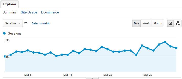
Now, if the people landing on your website is too low like in order of 100's, there is not much you can do in terms of conversions. At best, you can get 2-20 conversions. So, the aim should be to increase traffic via
- Writing more content and investing in SEO
- Increase your following on Social Media
- Paid Ads on Google, FB, etc.
Stage 2 : High Bounce Rate - Whoops, wrong turn
Again, Google Analytics is a good tool to know your bounce rate.
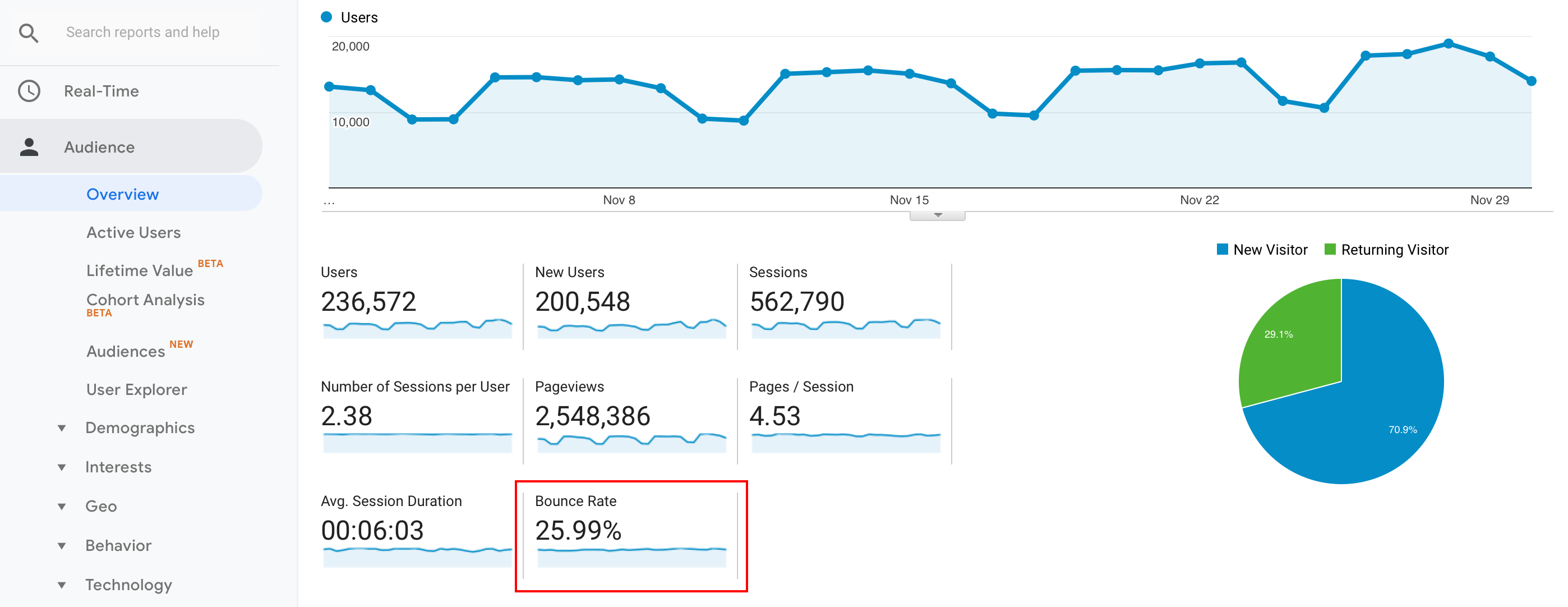
Google considers a session to be bounced if the visitor does not do a second interaction with the page in that session. So, if the visitor is reading content on your website just by scrolling down, Google will consider it bounced and hence their bounce rate is not 100% correct. You can fix this by adding events on scroll. You can read more about it here.
Average bounce rate for a landing page is around 49% with 26% on the lower side and 70% on the higher side with 90.1% on the highest side. - GoRocketFuel
To deeply understand the problem, you should try session recording and heat-mapping tools. These tools will give you a better visual understanding around your visitors unlike Google Analytics which is more of a quantitative tool.
By watching the session recordings of your visitors and heatmap of the page, you should be able to get a better insight or some inference on why users are leaving so early -
- Page load time is too high - Many sessions of length less than 5 seconds - Read more about it here
- Whether they are scrolling down or leaving from the head section - Fix header
- Scrolling down but losing attention - Build more trust with more humane sections like testimonial etc
- Drop in the middle of form filling - Asking too much too early, CTA language not exciting enough, etc.
Stage 3 : Low Engagement - Just missed
Marketers need to build digital relationships and reputation before closing a sale. - Chris Brogan
There is a low chance of conversions if visitors are not engaging with your page unless you are a brand and people are already sure of buying from you even before landing. How to measure engagement of a page?
#1 - You can check for the overall time spent on the page via analytics tools
#2 - Create Heatmaps to visulize your page for various engagement metrics. You can create color coded maps of your page based on click distribution, scroll depth and attention span to visually analyze the engagement levels of your page. (Red color being the best or hot and blue being the worst or cold)

With Click maps, you will know the elements most clicked and with scroll maps you will know the page depth upto which most of the visitors are scrolling.
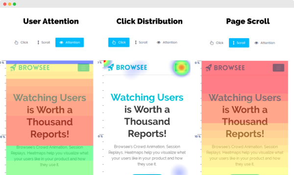
However, the most interesting is attention map, where you can check for how much attention visitors are giving on each section of the page.
See in the image below, by merely adding a human photo to the testimonial the engagement is increased by several multifold. (Red and yellow means higher attention and blue and green refers to lower attention levels)

What can I do to fix the Problems?
Well, if it can be thought, it can be done, a problem can be overcome.
― E.A. Bucchianeri
We know our stage of conversion, we know how far we are from the industry averages and maximums and we have identified some problems with our page. Let us move forward towards solving the conversion problem!
Well, to reinforce our landing page stage, we will reinstate on how important it is to know the core issue before focussing on solutions randomly.
Problems can be broadly classified in 3 areas -
- Not enough visitors landing on my page
- Visitors landing but leaving too early
- Visitors spending time yet not buying
Problem 1 is out of the scope of this article as we are focussed on solving page optimization problems. Thus, we will be focussing on problem areas 2 and 3 here.
Understand, you can have one or all of these problems. These problems are not sequential and are not completely independent of each other.
So, relax and keep reading!
Visitors Landing but Leaving too Early
Assuming that you have managed to bring in traffic on your website but your bounce rate is too high or visitors are not spending enough time.
Here are a few pointers to start with -
#1: Are your bringing in right audience?
If your website visitors are leaving too early, an important reason could be of expectations mismatch. May be they expected something else when they landed on you. Suppose, I searched on Google "Buy Rice" and an ad comes up:

Now, clicking on this link mistakingly took me to
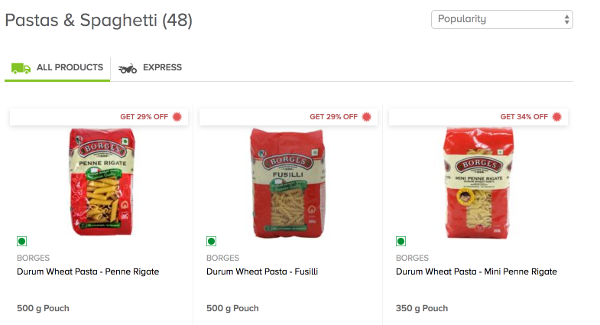
Boom! You will see a sudden drop. Your content, ads language etc should resonate with your landing page else there will be a sharp drop off.
#2: Is your page taking longer to load?
On the web, you get a short attention span from a visitor which will probably be going to be smaller than 5 seconds. If your page is going to take more than 2-3 seconds to load, you have already lost that to your competitor!
A study by Tagman shows that with each second delay in load time, your conversion decreases by 7% approximately.
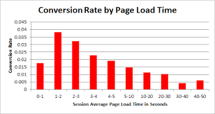
So, it is worth to spend some time to research a bit about page load time, measure them and make changes to make your page faster. You can use tools like Google PageSpeed or Google Lighthouse to know about your page load time performance and they will also give you personalized suggestions on what you can fix to improve it. You can read more details about it here.
#3 - Is your header or above the fold section truly captivating?
Your header section or above the fold section is the first thing that your users are going to notice. Make sure you present your best in this section.
You never get a second chance to make the first impression!
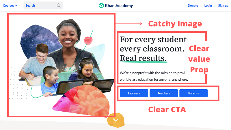
Your header or above the fold section -
- Should have a catchy image
- Should have a clear Call to Action (CTA)
- Should have a clear and precise one liner value proposition
Let us take an example of Khan Academy's landing page satisfying all of the above mentioned points.
#4 - Do your have a loud & clear Call to Action (CTA) on the page?
It is important to have a clear expectation from the visitors on a landing page. Your CTA should be loud, bold and clear. Best, if you can lure visitors with a language that seems to be in their interest than yours like "Free" or "Download Now".
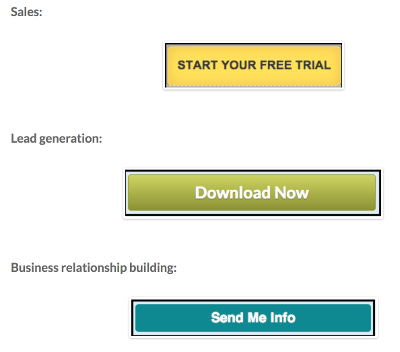
Remember, your landing page should have just one goal and it could be getting a contact, taking a survey, asking visitor to buy something or so. You should avoid doing too many things on your landing page
#5 - Are you Building Adequate Trust :
It is important to build some trust amongst your users if you are already not a big brand. Even, I have seen trust building activities on the sites of big brands as well. Now, you could gain trust by
- Having customer testimonials with their social profiles
- Having big client names or logos you work with
- Having an important metric displayed in hug fonts like "500k Orders Delivered", "Working with 50 Fortune 500 Companies", "100k Happy Customers", etc.
- Twitter embeds with positive wordings
- Having crowd sourced reviews and ratings from customers
Let us see a couple of good landing pages doing something similar -
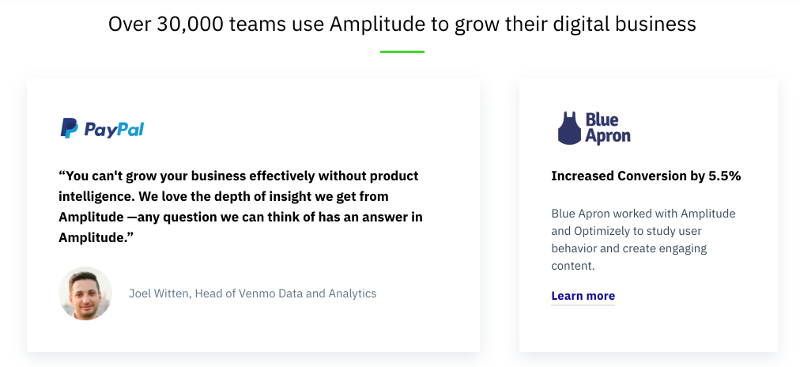
- Amplitude's landing page displays the total number of teams using them (an important metric) and customer testimonials to build trust
- Hubspot's landing page displays a list of logos of their big clients to gain trust from their visitors and to show them that they are in good company

- Amazon does it by having reviews and rating from their own customers to build enough trust that a visitor can buy that product.

Visitors Spending Time yet Not Buying
Once you make sure that your visitors are spending some time and are also engaged but why they are still not converting?
#6 - Do You have Unnecessary Verbosity on Page?
Do not fall into the trap of telling every feature to your visitor. Take the example of first date where visitor is coming on your page for the first time. Do you want to bore them by telling them every small details about yourself?
Do not write long sentences or tell about every feature you do. Be precise and try connecting with your visitor at an emotional level. So, instead of features listing, you can write more about use cases or even present them case studies.
For example, Mixpanel's landing page shows a variety of case studies on how they have helped their customers in improving their conversions.

and Salesforce's to the point value proposition
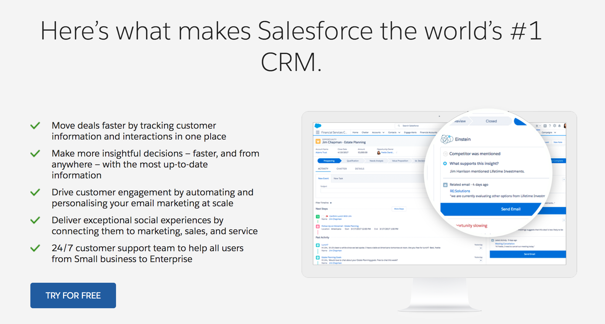
Key takeaways -
- Use bullet points clearly stating the value
- Do not write paragraphs as no one is going to read it
- Connect at an emotional level with use cases and case studies
#7 - Is Your Contrast for CTAs are Correct?
Your CTAs should tempt your customers with "Click Me..Click Me!!".
- CTA is a must in header section positioned to drive visitors attention
- Use bright colors
- Good contrast between background and CTA color
- Good contrast between CTAs background color and CTAs font color
- Easily readable and bold fonts
- Exciting language like "Buy Now", "Go For ..", "Get Free .."
#8 - Are You Asking for Too Much Too Soon?
As we have mentioned that your landing page is just like a first date with the visitors. Do you really want to rush into things too soon?
Your forms or CTAs will see a sharp drop off if you are asking for too much information too early on. Try to keep your forms as simple as possible.
A few SaaS tools like Asana do not even ask for passwords while creating an account. They send you a code in an email which can be used later to set a password.
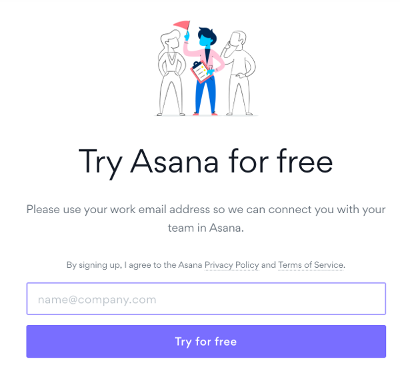
By using tools like Browsee and Hotjar, you can easily know how people are interacting with your forms and which fields are seeing maximum drop offs.
Also, it is advisable to not throw too many fields in form in one step. You can make a multi-step form so that users do not feel overwhelmed with your form like TypeForm does.
Key Takeaways -
- Avoid asking too much information to early visitors
- If needed, make a multi-step form so that visitors do not get overwhelmed
#9 - Is your page creating a sense of urgency?
Sometimes, visitors really like your product and understand the value but they need the final push from your end for being converted to a users.
Push yourself again and again. Don't give an inch until the final buzzer sounds. - Larry Bird
You can create a final push for conversion by -
- Offering them a discount which ends soon like in 2 hours or so
- Giving them something for free if they purchase in the next 15 minutes
- Creating deals which ends in a day

#10 - Are your lead forms converting well?
All landing pages have a static form or a signup button or some CTA. Sometimes, they work well and sometimes they do not.
In case, your forms or CTAs are not performing try more dynamic and proactive approach. Sometimes, static forms/buttons go unnoticed or users scroll down where they do not see a CTA.
You can use dynamic forms to capture interests from your engaged visitors. You can show a lead form based on their behavior knowing they have some interest in your product. You can target them -
- Scroll Based Forms - When a visitor has scrolled down a certain depth like 60% or so.
- Time Based Forms - When a visitor has already spent some time on your page say 30 secs or so.
- Exit Intent Form - When a visitor is going to close your website, you could show them a help/contact form.
#11 - Are You capturing enough interests?
Something is better than nothing. - Brownie McGhee
If a visitor has already landed on your page, it is important to aim for conversion but what if it looks it ain't gonna happen and visitor is about to close your page!
Thanks to the technology, we now know when a user is about to close the page. Be nice and offer them something for free in return for their email.
Once, you have an email, you can nurture them gradually to become a user.
These exit email collection forms work well if your offer something in return. It could be a free E-book, free advice
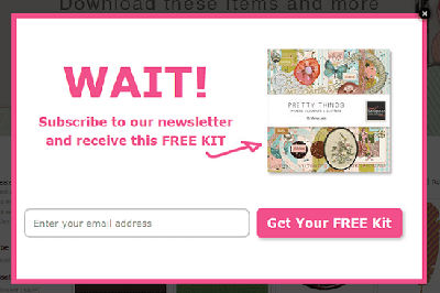
or a personalized discount on their first purchase.
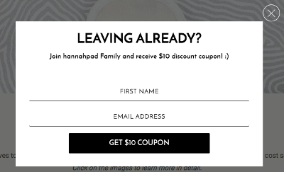
You can setup drip emails for these email Ids which will make them remember your brand and may turn them into potential customers one day!
#12 - Are you communicating well with visitors?
It is important to not treat your visitors as a source of lead or money. Be human, Be kind.
Sometimes, visitors have doubts which they wish to ask before saying yes to your product. You can use Free Live Chat tools for communication purpose. You can not imagine the number of queries you can get with such tools. Solving those queries may convert one of your visitor into a client.
If live chat is not possible or it asks for too much bandwidth, the next best thing you can do is to use a feedback or query form where they can send your queries.
#13 - Should I ask for help?
In the end, if nothing seems to be working, you can create a survey to ask the visitors directly that what is wrong with your website. You can collect a few points from those surveys and can start working towards them.
If you have liked the article and wish to optimize your landing page, I would recommend installing Browsee on your website.
If you need any help, you can directly reach to us at contact@heroteck.com.
Ciao!
How much is a great User Experience worth to you?
Browsee helps you understand your user's behaviour on your site. It's the next best thing to talking to them.


