12 High Converting SaaS Landing Page Designs
Landing pages are designed with just one goal in mind - to get more conversions. These are the pages where people land after clicking on Ads, Email, Referrals, etc.
Usually marketers create different landing pages for different discounts, social media campaigns or ads so that they can focus on just one thing and see if that's getting enough conversion.
Remember, your landing pages are like your first date with you potential customers. Trust me, you do not want it to go wrong.
For SaaS businesses, homepage is usually use as a landing page as well. They both have just one goal i.e. to get a signup or an email.
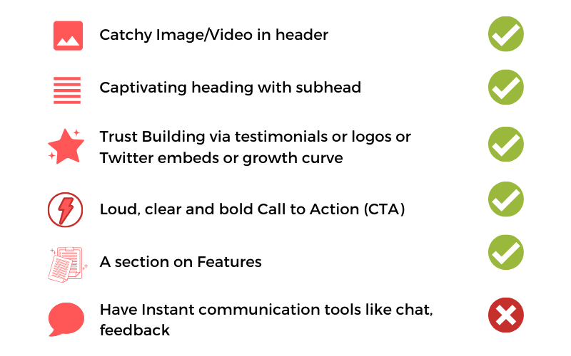
Commonly Used Practices from Top SaaS Products
The concept of landing pages is not new. So, we researched some of the top SaaS products to understand what is common amongst them.
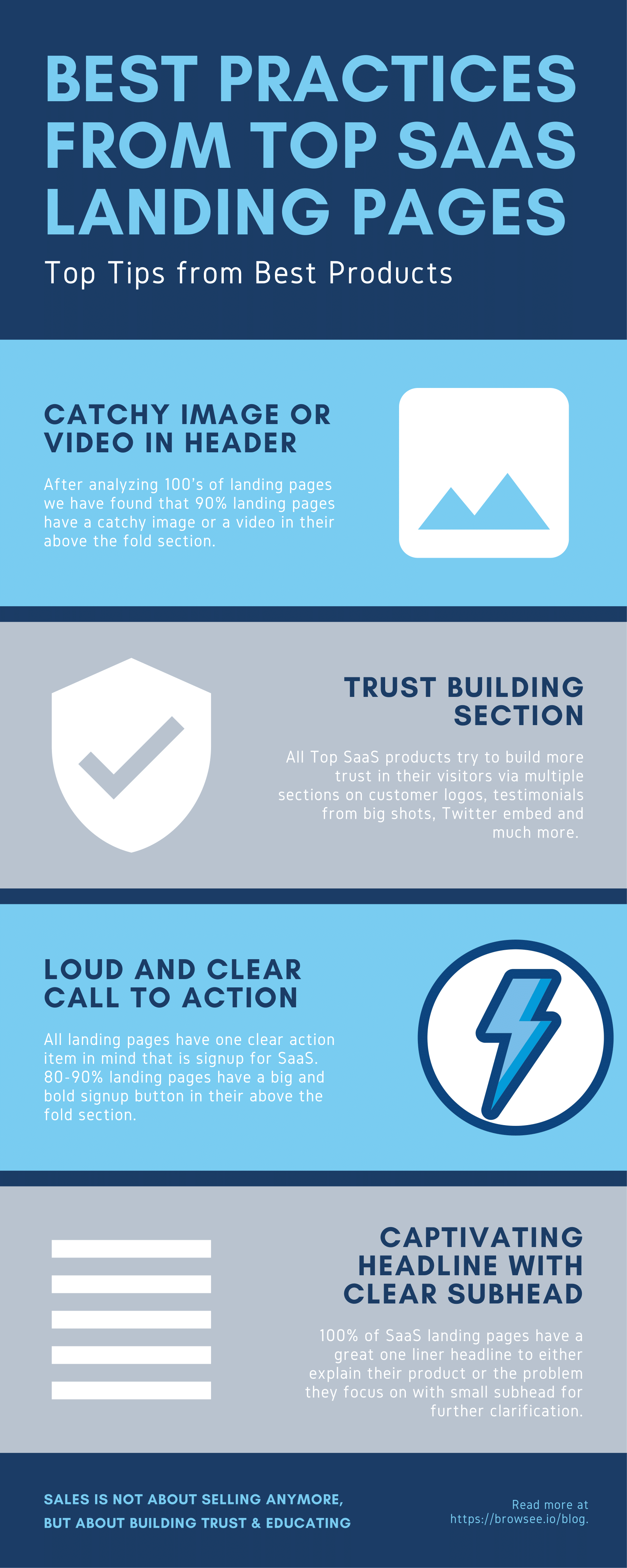
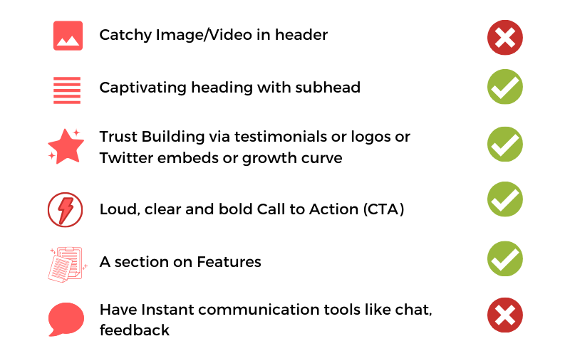
Here are some the most common things amongst all top SaaS landing pages -
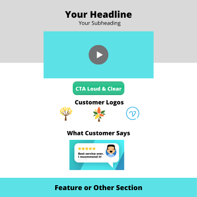
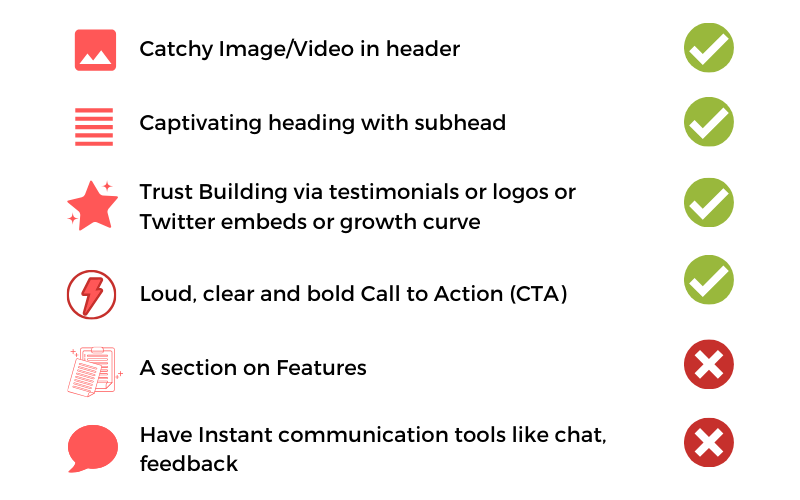
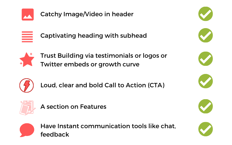
- A catchy image or video above the fold
- a great one liner headline addressing what the product does or the customer's pain-point
- A small subhead to give a little more clarity on product
- A loud and Clear CTA - Mostly signup buttons
- Mandatory social proofs including one or many from client logos, client testimonials, number of customers, growth curve and award or accolades.
- A couple of top features (not 100%)
- It is advised to address any critical concern on the home page itself like privacy, competitive advantage etc
Real Examples from Industry
Let us see some of the top landing pages from hot shots to draw some inspiration from their designing, color palettes, CTAs, Headings and much more.
Let us take an in depth look on their landing pages and what makes them better than the rest!
Notion's Landing Page
Notion has a black and white themed landing pages with pastel colors in between for CTA's etc. This makes the CTA's shine in comparison to the rest of the page.
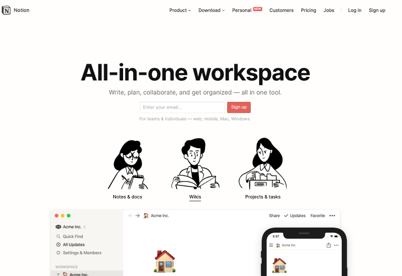
Notion's landing page has a creative and clear above the fold section.
Key Points -
- Smashing & Clear headline with detailed subhead
- Made it look insanely simple to start using Notion by just entering an Email
- Testimonials from big companies to build trust amongst visitors
- A live demo section where you can try out the product as a user
- Twitter Embeds to gain more customer trust
To get further design inspirations from Notion, click here.
Basecamp Landing Page
The landing page for Basecamp has some similarity with Notion in terms of landing page color palette. They also have a black and white theme with sharp colors for CTAs making them clearly visible.
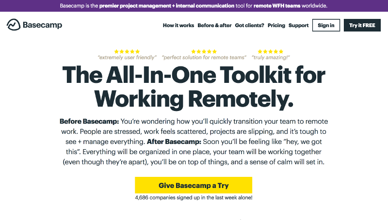
They have a high verbosity above the fold section which seems to be working well for them. They do not have any image in above the fold section however they have included some top reviews at the top of the page.
Key takeaways -
- 3 testimonials shown in above the fold section to gain trust from visitors
- Uncommonly seen high verbosity in above the fold section with before and after Basecamp
- Big and bright yellow button with exciting text "Give Basecamp a Try"
- Features explained via a product snapshot with text boxes on it
- Big testimonial section followed by their growth graph which is really impressive
Basecamp's homepage is one of the real world examples which shows that
Don't be feature verbose on your homepage instead try to connect with your visitors on an emotional level.
They have just one small section on features and the rest is all about their current users and how they are enjoying Basecamp.
To get further design inspirations from Basecamp, click here.
New Relic's Landing Page -
New Relic helps companies to in monitoring their app, DB or server's performance and their uptime.
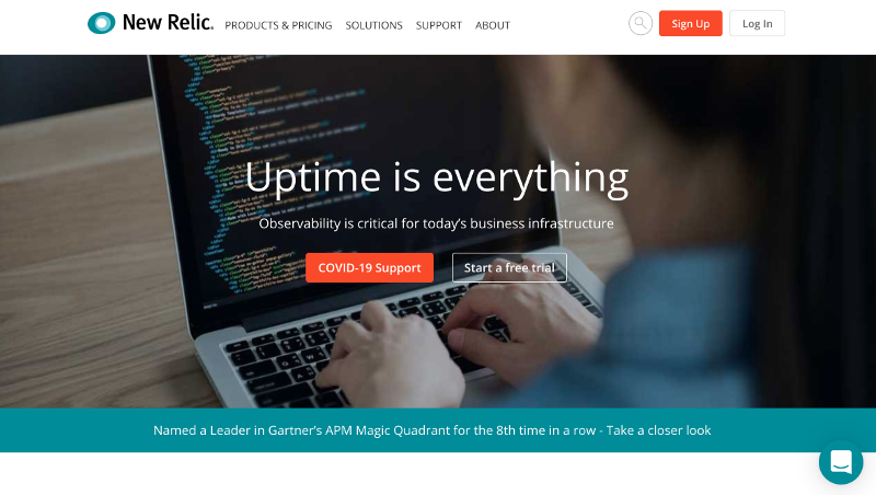
New Relic is a developer centric product and thus the sections are designed according to their user type.
Key Takeaways -
- Image above the fold resonates with their audience where a girl is coding on Macbook
- A clear CTA mentioning they have a free trial although the contrast of CTA could be a little better
- Right below the image, they have a bright alert mentioning that they have been named "A leader in Gartner's APM Magic for the 8th time" to build more trust amongst the audience
- To convince engineers, their homepage is more feature centric with a couple of line graphs to reinforce their usability
- They have a testimonial section at the bottom to build more trust
- A chat tool to instantly answer any user queries
To get further design inspirations from New Relic, click here.
Amplitude's Landing Page
Amplitude has a pretty small and focussed landing page. It does not talk too much about themselves. Idea is to convey what they do, build some trust and have a live demo where you can actually explore how the product works and what all you get inside sparing your from all the mystery.
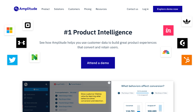
Their above the fold section has a CTA for exploring demo instead of signup. This is something unique to Amplitude as opposed to the rest of the SaaS homepage that we have seen so far.
They have all the big shots logo right in their above the fold section which shouts that Amplitude is really a great tool used by fortune 500 companies!
Key Takeaways -
- Amplitude's homepage is all about gaining visitor's trust.
- Interestingly, they do not have a sign up button on their home although watching a demo require visitors to enter a work email id.
- Big and Bold live demo button instead of signup to take a look and feel of the complete product before they signup for them
- You can see customers logos in above the fold section and then a list of different set of customers industry wise in the next section
- Testimonials from some big shots
- A section on how many customers do they have and how many of them are from fortune 500 companies
To get further design inspirations from Amplitude, click here.
Pagerduty's Landing Page -
Pageduty is a tool for detecting, managing and communicating any infrastructure related problems. Pagerduty has a headline mentioning its importance in the real world. Instead of focussing on what they do, they have tried to relate their product to the real world.
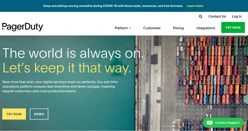
Key Takeaways -
- Bright and Shiny Yellow CTA with text "Try Now"
- Contact Support form for answering any visitor queries
- Customer logo and customer testimonial section to gain trust from the audience
- Like New Relic, Pagerduty is another developer centric product and hence they have focussed a bit on the features in their third section
- To gain trust, they have case studies from big shots telling how much they have reduced their downtime via Pagerduty
- They also have an interesting "Why Pagerduty" section in the end to show their competitive advantage over others
To get further design inspirations from Pagerduty, click here.
Trello's Landing Page
Trello is a task management tool to easily create kanban boards and easily assign it to anyone in the team.
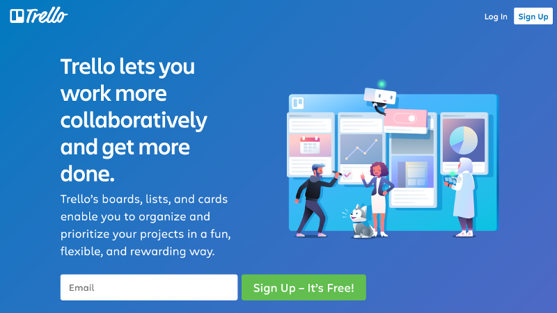
Key Takeaways -
- On the point, designer image with kanban board and team members giving clear indication on value proposition
- Asking only for email for signing up
- Loud and Clear Signup button clearly stating that the tool is free (obviously upto a certain limit but you can get a taste in free)
- Only 2 action items in header bar - Signup and Login
- Explained features and integrations in the next couple of sections
- Last section states a few teams from big shot companies using Trello
To get further design inspirations from Trello, click here.
SendinBlue Landing Page
Sendinblue is an email marketing automation tool.
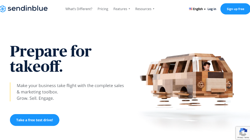
Key Takeaways -
- Interesting animation on the right showing automobile evolution which is analogous to evolution of automated email marketing
- Big blue button asking for signup as "Take a Free Test Drive" which is again in correspondence to automotive animation example
- A condense feature list
- Addressing privacy concern section to answer any user query on privacy
- Couple of sections on users and testimonials to build trust amongst visitors
To get further design inspirations from Sendinblue, click here.
Datadog Landing Page
Datadog is a tool used to monitor and create alerts for any application, database, servers and services.
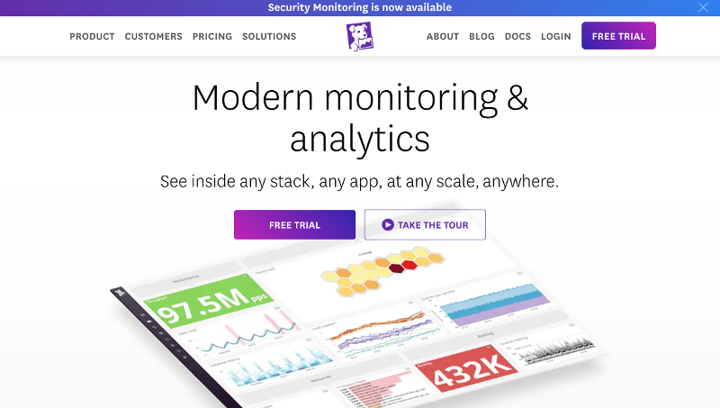

Key Takeaways -
- Beautiful image with interesting graphs to tempt engineers
- Gradient button with "Free Trial" text to get instant attention
- They also have product video (comes on take a tour button) to understand key product features
- Big client's logos and an award to establish them as a market leader in a visitor's mind
- Section on environments they can work with just to handle upfront any query in a visitor's mind
To get further design inspirations from Datadog, click here.
Zapier Landing Page
Zapier provides you an integration framework to connect various apps and automate your work flows.
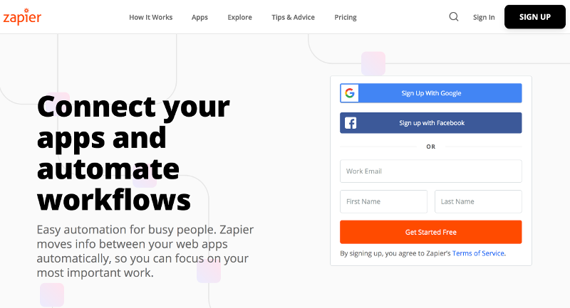
Key Takeaways -
- Simple headline to clearly intimate a visitor about their value proposition
- A sign up form right next to headline with easy options like Google and FB signup as well
- Bright orange button with text "Get Started Free" to lure customers in trying Zapier
- Customer logos section to build trust
- Telling a bit about integrations to answer any query in visitor's mind
- Multiple big CTAs embedded after each section asking visitors to signup for free
- Testimonial section at the end for building more trust
To get further design inspirations from Zapier, click here.
Sentry Landing Page
Sentry is an error monitoring tool which alerts a user whenever a crash or error happens on their application with full stack trace.
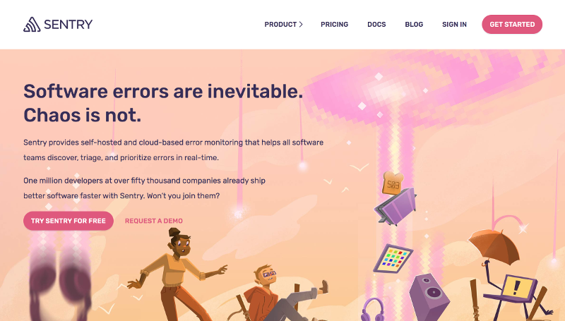

Key Takeaways -
- An interesting above the fold image representing chaos in IT world with big CTA saying "Try Sentry for Free"
- Big description subhead to explain the main product features
- A product video explaining features
- Big customer logos section to build trust
- Section on individual features
- Video testimonials from big shots to drive more trust - The more human angle you will bring into your testimonials, the more trustworthy they will become.
To get further design inspirations from Sentry, click here.
Buffer Landing Page
Buffer is a growth tool for marketers via which they can plan and promote their content on social media platforms like Twitter, Instagram etc.

Key Takeaways -
- Buffer has an interesting graphic representing the importance of their tool
- A strong headline to connect with the users at more emotional level as growth is something every startup craves for
- Big blue button with "Get Started Now" text
- Customer logo and testimonial sections to build trust
- A section on features
To get further design inspirations from Buffer, click here.
Canva Landing Page
Canva is Photoshop like designer tool for newbie designers. Canva has the simplest and shortest landing page of all.
Key Takeaways -
- An image clearly stating the value proposition
- Big buttons for signup via Google, FB or Email
- Just 4 words in headline to explain their value proposition!
To get further design inspirations from Canva, click here.
Tools to Improve Your Landing Page Conversion
If you have an optimium landing page conversion, you may not want to do more. But, for those, who are continuously chasing a better conversion, here are a few types of tools that you can use to improve your conversions -
- Check for page load time via Google PageSpeed or Lighthouse. Your page performance is diretly related to your conversions
- Measure engagement on a page via a heatmap tool like Browsee
- Know if there is a particular reason for users dropping by watching their session recordings via Browsee
- Install a live chat tool for instantly knowing user concerns. You can use Tawk or Hubspot chat which are free to use (with branding of course)
- Use dynamic forms if static CTAs are not performing. You can ask for contact information when a user is about to exit your site by offering them something in free like an E-book or free session etc.
- Nurture your leads and customers via drip marketing techniques to convert them later into customers
You can read more about such techniques here.
If you have liked the article and wish to optimize your landing page, I would recommend installing Browsee on your website.
If you need any help, you can directly reach to us at contact@heroteck.com.
Ciao!
How much is a great User Experience worth to you?
Browsee helps you understand your user's behaviour on your site. It's the next best thing to talking to them.

