How to Optimize my Website?
Let us first understand what do we mean by "Optimizing a Website"? A highly optimized website is like a self-running motor where people come and buy something without anyone doing much. It is a mammoth problem but can be broken down into three sections -
- Making sure to bring in right visitors
- Gaining trust before marketing/selling
- Converting Visitors
Section 1 - Bring in Right Visitors
Bringing in the right audience is one of the most important factor that we should consider while optimizing our websites. You must be trying different methodologies like writing content, posts on social channels, ads, etc to get more traffic.
Write compelling content resonating with your product landing page.
This is the mistake that we made earlier. We wrote too much tech driven content because of our engineering backgrounds however our product was oriented towards marketers and product managers. Result, See for yourself!
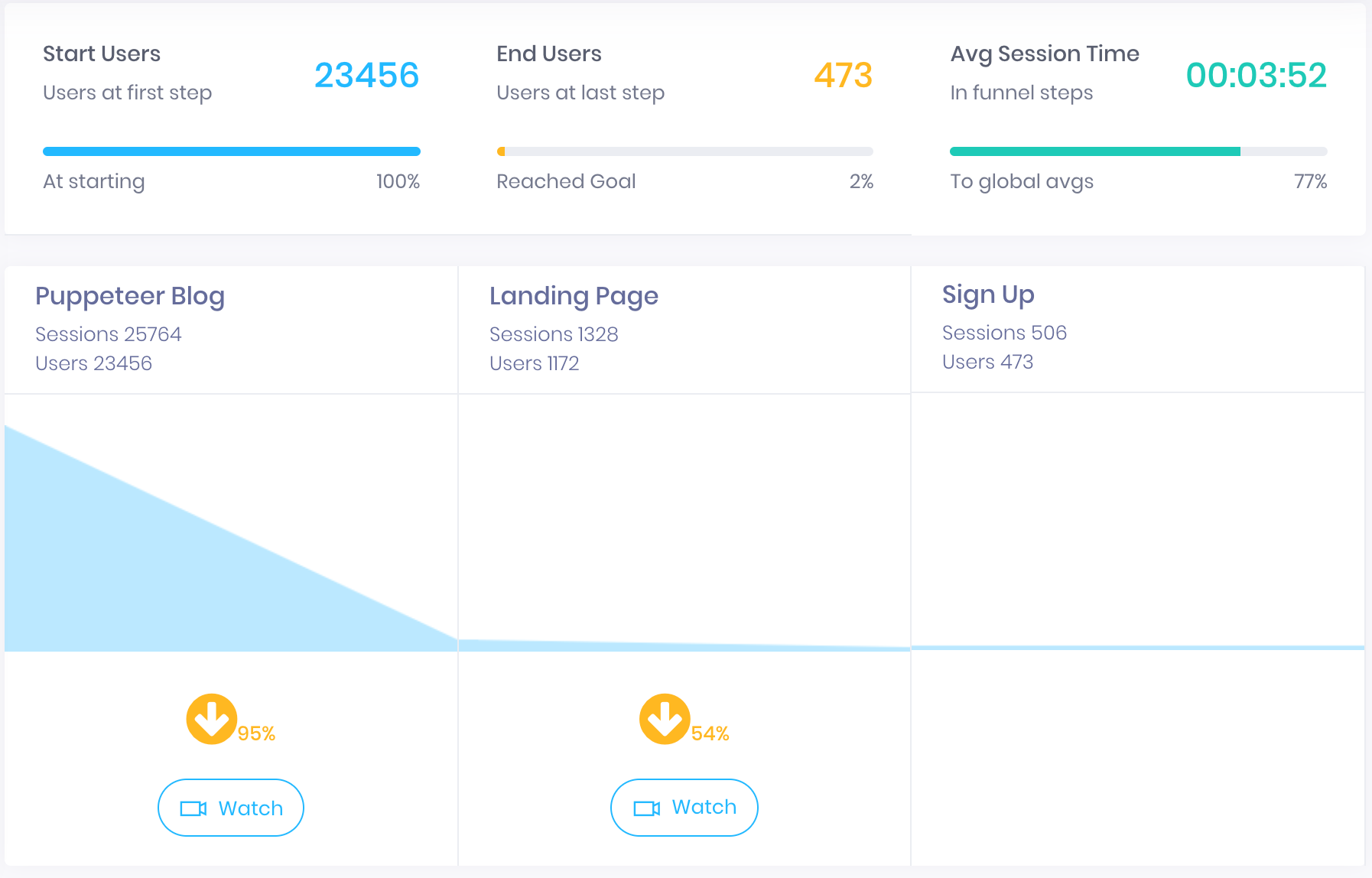
There was a sharp 95% drop from blog to landing page and a further 54% drop from landing page to signup. Poor us!
Be sure that your content or ads voice should resonate with your product's landing page.
Create multiple landing pages for multiple features/value propositions based on the audience type.
You need to target specific queries with different landing pages and ad language. You can not show the same ads for rice and cream as shown below. See the images below:


You will see a particularly high Bounce Rate in Google Analytics if you would fail to do so. The path to optimzation is measure, measure and measure! Know that your instincts are not a substitute for the real data. So, get a tool and measure your numbers!
The price of light is less than the cost of darkness. - Arthur C. Nielsen
It is important to funnel your traffic and to know the impact of each channel. I am talking about a funnel here because some of the channels may give you larger traffic [as shown in funnel above] but may give you lesser signups or orders.
You can create funnels via Google Analytics or any other funnelling tool. With Session Replay tools like Browsee, Hotjar, FullStory etc to know any sharp drop-off at any step of the funnel by watching dropped sessions of that step.
One of the best ways to determine what customers want is to watch them - Paul Graham
It could be done in person or by merely watching a few dropped sessions at each step gives you some idea around what is going wrong.
Sometimes, it could be as simple as your page took too long to load!
A good first impression isn’t just about design, but also how fast that design loads. - Tommy Walker
Even with the interested audience on my website why I am not getting any conversions or the user engagement is pretty low? Or, in terms of Google Analytics why my Bounce Rate is still so high?
You should know that you only get a very short attention span of your user and if your website takes a heavy time to load then you have already lost that opportunity.
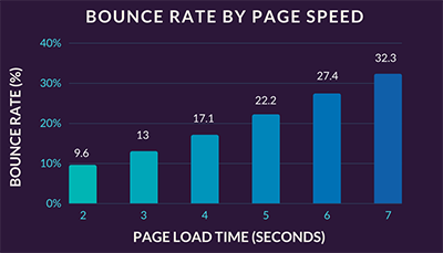
As you can see, every second counts and with each second increase in load time there is a significant increase in bounce rate. There is only a 9.6% bounce at 2 sec page load time however a 32.3% bounce at 7 seconds load time.
You should check for your page load time by entering your URL in Google PageSpeed tool.
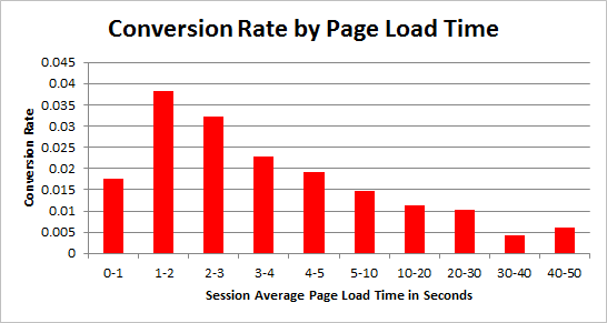
Also, your conversions are impacted by page load time. Tagman study shows that with each second delay in load time, your conversion decreases by 7% approximately.
Section 2 - Gaining Visitor Trust Before Marketing
So, now that you know:
- You are bringing in interested audience on your website
- Your page load time is as perfect as you can make
Once a visitor is already on your page, they are giving you an opportunity to engage them and gain their trust. Use this!
Even when you are marketing to your entire audience or customer base, you are still simply speaking to a single human at any given time. - Ann Handley
Your website or landing page should not should "Marketing XYZ". What it should shout is "I am XYZ - Can I help".
Asking for help is one of the hardest thing. Thus, as product owners, it is our responsibility to make a visitor feel comforted & trusted before even trying to make a sale or marketing them our "XYZ".
Now, How do I gain trust? A simple answer to a difficult challenge -
A satisfied customer is the best business strategy of all. - Michael LeBoeuf
Thus, user more customer testimonial, ratings, social proofs like Twitter embeds, etc from customers to gain trust. Make it as humane as possible by adding customer photos, links to their tweets, their companies and profiles, etc.
For SasS businesses, another big proof is names and logos of big shot or fortune 500 companies using their tool.
Once you have gained their trust, it is time to gain their attention towards your product and assure them how it can be useful for them. Answer their questions like what, why, how, why you and beyond. Use simple case studies or examples to make them believe so.
Once you have created a page or a website, now it is time to measure the performance. As we discussed, it is important to measure so your decisions are backed by data and not biased by personal instincts.
You can create a heatmap with tools like Browsee, Hotjar to mesaure the engagement on a page. Once you will create a heatmap, you will get:
- Click Maps - Using click maps, you exactly know where users are clicking the most.
- Scroll Maps - To understand upto what percentage of the page majority of your users scroll
- Attention Maps - These are very interesting as you can instantly know the sections on which users are spending most time.
Once you have an understanding around your page, you may be able to understand what needs to be fixed.
For example, in our homepage attention map we can see that visitors are paying a lot of attention on Customer Testimonials and are not spending enough time on the sections above it as shown below
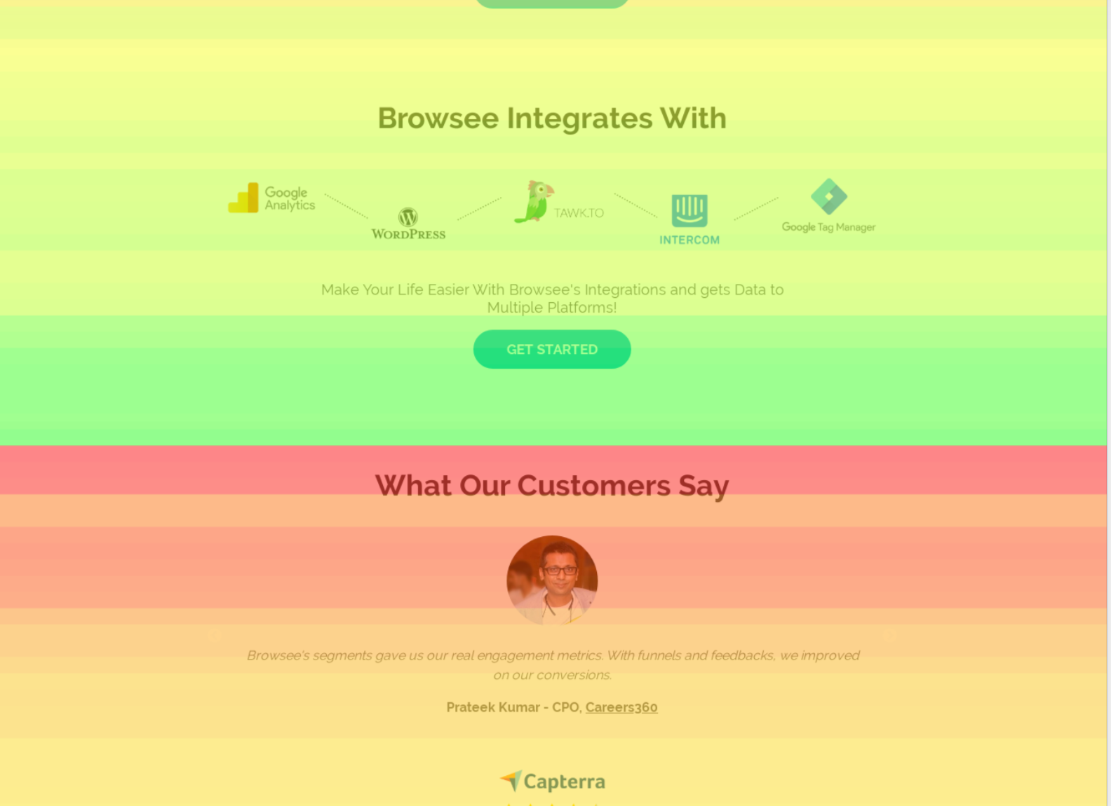
From our scroll heatmap, we know that not many visitors are scrolling to this point as shown below
Thus, it makes sense to move this section upwards, so that it can come into the sight of more visitors who left even without scrolling upto this point.
You can also A/B test a few things on your page to improve the engagement or conversions. With click, attention and scroll maps data combined with A/B testing has huge potential in optimizing your page. You can either create multiple versions of your page and serve them or you can use tools like Optimizely for making HTML level changes without writing any code.
Once you have made changes to the page, you can also compare the heatmaps between two changes to know if it has a positive impact on engagement or not.
With Browsee, you get continuous heatmaps which means we keep on collecting data for your heatmap without limits on number of sessions unlike a few other tools. What this means is you can compare the performance changes of your page at any time T. So, let us compare the testimonial section vis-a-vis to see the impact on engagement:

By merely adding the Linkedin Photo of our user instead of having a random image with two people talking, we have significantly enhanced the engagement as shown above.
Adding real faces on landing pages improves engagement upto 30%
Converting Visitors
Every aspect of marketing is entirely useless unless it produces conversions. - Jeremy Smith
Thus, everything we have had discussed till now only makes sense if we are able to convert our visitors on our site.
Your forms and CTAs positioning, language, static/dynamic etc affects your conversion rates.
You need to understand your audience visiting your website. It could be -
- Interested Audience - S/he has a lot of interest in your product and immediately signs up or buys something
- Less Interested Audience - S/he has landed on your website from a research angle and is not ready to commit anything yet
- Non-Interested Audience - S/he has no interest in your product and landed their wrongly or doing competitive research or anything but they have no interest in buying your product whatsoever
You should have a mechanism to cater anyone landing on your site. So,
- For Interested Audience - We need to make sure that we have a good experience for them, everything should work, no slowness, CTAs should be clearly noticeable etc. Since, these are already interested people, you can not loose them at any cost. To be sure that you capture them -
- Show a dynamic form after some delay
- Show them a form after a certain scroll
- Instant Discounts for a Limited Period
- For Less Interested Audience - We understand that these audiences are not yet ready to buy or product. Think of the next best thing you can do with such visitors? Yes, correct you can ask for their emails and make them educated about your product for some time before you get their buyin.
- Show an email capture form on exit
- Ask for email at any relevant pages like product pages etc.
- Give them something for free to make them feel good about your product and also for remembering your brand
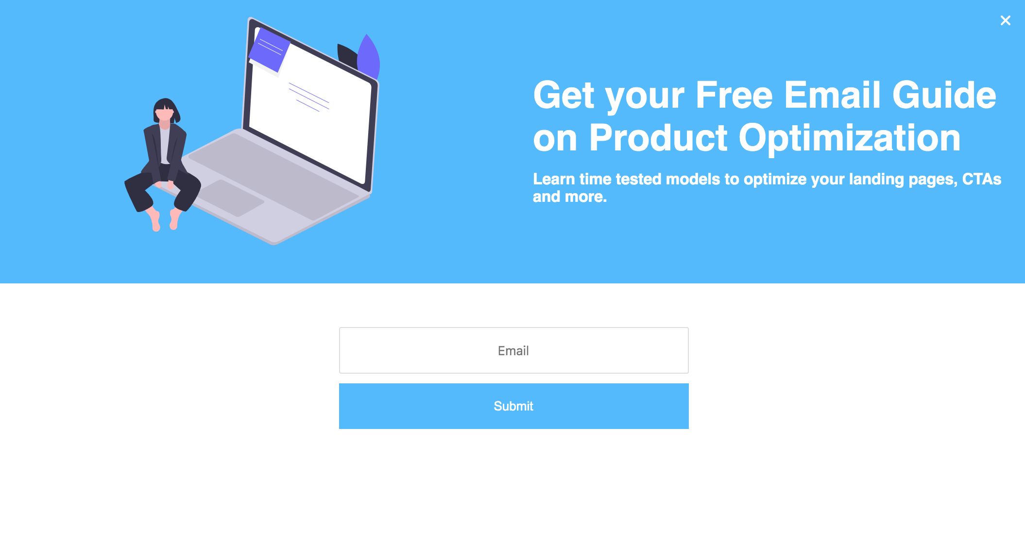
Concept of Lead Magnets -
As Neil Patel says, you give something for free to your users to get their emails and a permission to send more free stuff in the future.
These are called Lead Magnets and anyone merely interesting in your value proposition will not be able to say "NO" to that.
Quick Tips
Supposedly, by even doing all of the above mentioned efforts, you are unable to convert users. Then, we need to take a step back and ask our visitors that what is wrong.
Look for Signs - By watching their session recordings which is as good as watching your users using your product live. You can use session recording tools like Browsee, Hotjar or Fullstory.
Ask for Feedback - Run a feedback widget asking for their help or their feedback on your value proposition or product design or anything. You need to constantly test your language for getting the maximum conversions on the form, hence it is better to use a 3rd party tool where you can create no-code feedback forms like in Browsee or Hotjar.
Live Chat - If you have a live chat tool on your website and somebody is there to listen, I have realized that people are very much vocal about their concerns. Just by answering their queries, you can improve your conversions or iterate on the product or value proposition.
Ask for User Interviews via Hangout or Zoom Meetings - If nothing seems to be working, you can just keep on asking to your visitors to give you a hangout or zoom call where in you can personally clarify your doubts.
Best Practices from the Top Product - You should always learn from the best out there. Just identify a few products in your market who are doing really good. Look for their product quality, designs, landing pages, pricing models and try to figure out what might be wrong with yours.
You can use UXhunt for getting inspirations from some of the best products around the globe.
If you have liked the article and wish to optimize your website, I would recommend installing Browsee on your website.
If you need any help, you can directly reach to us at contact@heroteck.com.
Ciao!
How much is a great User Experience worth to you?
Browsee helps you understand your user's behaviour on your site. It's the next best thing to talking to them.


