Grid structure in Tailwind vs Bootstrap
Tailwind CSS and Bootstrap both have pretty wonderful strategies when creating grid structures. If you use Tailwind CSS, you’ll have access to an exceedingly flexible grid system with the purpose of making even the most problematic layouts a breeze to create. With Tailwind CSS, you could adjust the grid in any way you choose, together with the wide variety of columns, the gutter width, and the breakpoints. Since Tailwind CSS’s grid classes are generated dynamically, you may tailor the grid settings for your CSS file to your project’s unique necessities.

To create a grid with four columns and an opening among every element, you only need a short code in comparison to the usual CSS:
<div class="grid grid-cols-4 gap-4">
  <div>01</div>
  <div>02</div>
  <div>03</div>
  <div>04</div>
</div>
You use the utility class "grid" to tell any child elements that they'll be a part of the grid, with “grid-cols” placing them in a vertical or column formation. “Cols-4” sets the column to be counted to 4, and finally, the “gap-4” class applies a spacing of 1 rem or 16 px among every element.
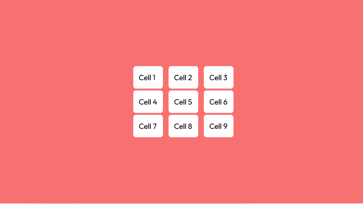
In comparison, Bootstrap’s grid system is more conventional, with fixed breakpoints and a smaller series of grid classes. There are 12 columns in the Bootstrap grid system, and you may set the width of every element in response to various screen sizes.
Although this approach might appear less complicated to apply initially, keep in mind that it truly may limit your freedom to design resourceful and delicate styles. So as a developer, you will not be able to provide your own personal touch and might be limited to supplying a more common one; this form of development removes any room for originality in front-end development.
Having stated that there are benefits and drawbacks to both grid systems. While the grid system in Tailwind CSS is very adaptable and makes it easy to construct even tricky layouts, it might be difficult to understand for new programmers. The grid system of Bootstrap is more intuitive and user-friendly than that of Tailwind CSS, although the latter can be perfect for extra-complex designs.
The choice between using Tailwind CSS or Bootstrap’s grid system has to be made based on the specific requirements of your project. Tailwind CSS is a fantastic option if you want a flexible grid system with many customization options. Bootstrap, then again, is a terrific selection in case you want a clearer and easier-to-use grid format.
Differences Between Tailwind CSS and Bootstrap Grid

- Flexbox vs. CSS Grid: Bootstrap makes use of Flexbox to create its grid system, while Tailwind CSS uses CSS Grids. CSS grids are more effective and flexible than Flexbox and permit more complicated layouts.
- Number of Columns: Bootstrap has a twelve-column system, while Tailwind CSS could have as many columns as needed. This makes Tailwind CSS more customizable and flexible.
- Responsive Tiers: Bootstrap has five default responsive stages, while Tailwind CSS can have many responsive levels.
- Gutter Space: Bootstrap has a built-in gutter space, while Tailwind CSS does not. However, gutter space may be added in Tailwind CSS through the use of the gap utility.
- Customizability: Tailwind CSS is more customizable than Bootstrap as it offers a fixed set of utility classes that can be used to create custom designs quickly. Bootstrap, alternatively, presents pre-built components that may be custom-designed with the use of CSS.
Using Tailwind CSS Grids to Recreate the Bootstrap Grid
Bootstrap Grid is powered by Flexbox; it has a twelve-column system, five default responsive stages, and a mobile-first system. Tailwind CSS grids are powered by CSS Grids, which technically can have as many columns as required, 5 responsive tiers, lots of gutter gap utilities, and are easily customizable.
Let’s take the following Bootstrap grid:
<div class="container">
  <div class="row">
   <div class="col-sm">One of three columns</div>
   <div class="col-sm">One of three columns</div>
   <div class="col-sm">One of three columns</div>
  </div>
</div>
This will get us three columns. We can recreate the same on Tailwind by using this.
<div class="grid grid-cols-3">
  <div>One of three columns</div>
  <div>One of three columns</div>
  <div>One of three columns</div>
</div>
We are using the CSS grid here and splitting it into three columns by means of the Grid Template Columns tailwind utility.
CSS Grids don’t have any gutter space built in, like Bootstrap Grid; however, we will add that by using the gap utility like this.
<div class="grid grid-cols-3 gap-8">
  <div>One of three columns</div>
  <div>One of three columns</div>
  <div>One of three columns</div>
</div>
Since those grid utilities are mobile-first automatically, we must add different grid utilities to make sure they look right on mobile.
<div class="grid grid-cols-1 lg:grid-cols-3 gap-8">
  <div>One of three columns</div>
  <div>One of three columns</div>
  <div>One of three columns</div>
</div>
Here, on the bottom device width, the whole thing would be on one column, and after it hits the lg breakpoint, it would be three columns.
We have utility classes for as many as 12 columns, so we will have a 12-column layout like Bootstrap. These same responsive classes will also be used for gap utilities. The gutter gap below will increase after it hits the lg breakpoint. Like this,
<div class="grid grid-cols-1 lg:grid-cols-3 gap-4 lg:gap-8">
  <div>One of three columns</div>
  <div>One of three columns</div>
  <div>One of three columns</div>
</div>
But what if you want to change the column sizes separately? You can do this with grid column utilities.
<div class="grid grid-cols-1 lg:grid-cols-4">
  <div class="col-span-2">Takes two columns</div>
  <div>One of three columns</div>
  <div>One of three columns</div>
</div>
The above code uses the grid column utility to make the first column take up two columns. And this is also mobile-first. So, in case you want it to take up one column on mobile, you may do the following:
<div class="grid grid-cols-1 lg:grid-cols-4">
  <div class="col-span-1 lg:col-span-2">Takes one column on mobile and  two on desktop</div>
  <div>One of three columns</div>
  <div>One of three columns</div>
</div>
And that’s the best and easiest way to create a grid in bootstrap, just like the grid in the tailwind.
Conclusion
To wrap up, Bootstrap and Tailwind CSS provide special methods for grid structuring, and the choice among them depends on your project necessities, familiarity with CSS, design preferences, and the amount of control you need over your patterns. Each framework has its strengths, and the selection should align with your precise improvement wishes and dreams.
If you’re after a quicker development device and less time designing, then Bootstrap is your best choice. Its pre-built CSS components and UI kit can prevent wastage of time, letting you focus on coding. But know that using pre-constructed components may additionally restrict your design alternatives, and your web page might also appear common.
On the other hand, if you’re seeking out extra control over your layout and want a very particular internet site that showcases your frontend abilities, Tailwind CSS is the way to go. Sure, constructing your components from scratch will take extra time, but the low-level utility classes provided through Tailwind CSS will offer you whole innovative control over your layout.
How much is a great User Experience worth to you?
Browsee helps you understand your user's behaviour on your site. It's the next best thing to talking to them.

