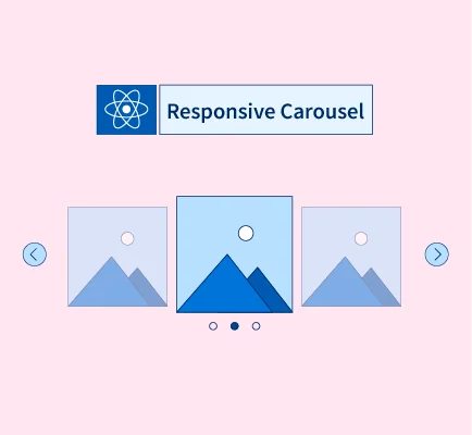
Creating a carousel in ReactJS
An interactive carousel is a tool used to display images, text or a combination of various HTML elements. Raect.js is a popular tool used to create interactive carousels for different projects. It contains a JavaScript library to generate user-friendly interfaces. So, if you want to create responsive web applications, then React.js can be your option.
An Introduction to Carousel
If you want to have photos and videos on your web applications, try Carousel. It is a slideshow-type component that gives one a professional look at their projects. So, if you are searching for an option to give an interactive look to your services and products, you should use carousels on your website.
A carousel can have various benefits for your project. Some of their advantages are mentioned below.
- It is a way to attract more traffic to your website.
- If you want to show multiple videos, photos, and gifs on your website, carousels can be your option.
- A carousel can keep your page organized and give it an appealing look.
- To create an interactive user experience, you can create carousels for your website.
Do you want to create interactive carousels for your website? If yes, then keep reading ahead!
How do I generate a carousel in React.js?
When creating a carousel in React.js, an easy procedure is followed. There are two popular libraries that you can choose the results from. In addition, several built-in features are also available that can help you in creating qualitative content. So, let us see how a carousel can be created in React.js.
You can use built-in features.
One of the most popular way to create a carousel in React.js for your project is by using built-in features. Many components are available in this tool that can provide the required services. The codes are as follows:
import React, { useState } from 'react';

const Carousel = () => {
  const [index, setIndex] = useState(0);
  const length = 3;
  const handlePrevious = () => {
    const newIndex = index - 1;
   setIndex(newIndex < 0 ? length - 1 : newIndex);
  };

  const handleNext = () => {
    const newIndex = index + 1;
    setIndex(newIndex >= length ? 0 : newIndex);
  };

  return (
    <div className="carousel">
      <button onClick={handlePrevious}>Previous</button>
      <button onClick={handleNext}>Next</button>
      <p>{index}</p>
    </div>
  );
};

export default Carousel;
The code above uses the useState hook to generate a state variable known as an index. It will keep track of the current position of your Carousel. The options such as handlePrevious and handleNext functions will update the index value when one clicks the Previous and Next buttons.
At last, the markup will show the index value in the paragraph tag. You can also display the images or videos of the text you want using the codes above. In addition, one can also design and style the CarouselCarousel using options like normal CSS, CSS framework or Tailwind CSS.
Pure react carousel library.
Another method to generate a carousel in React.js is the pure React carousel library. It is a powerful method to generate a carousel by using various components. To use a library, one should first install a command. The command is as follows:
npm install pure-react-carousel
Below an example is given on how to use a Carousel component.
import React from 'react';
import { CarouselProvider, Slider, Slide, ButtonBack, ButtonNext } from 'pure-react-carousel';
import 'pure-react-carousel/dist/react-carousel.es.css';

const Carousel = () => {
  return (
    <CarouselProvider
     naturalSlideWidth={100}
     naturalSlideHeight={120}
     totalSlides={3}
    >

    <Slider>
      <Slide index={0}>Slide 1</Slide>
      <Slide index={1}>Slide 2</Slide>
      <Slide index={2}>Slide 3</Slide>
    </Slider>

    <ButtonBack>Back</ButtonBack>
    <ButtonNext>Next</ButtonNext>
   </CarouselProvider>
  );
};
export default Carousel;
Several benefits of using the pure react carousel library are as follows:
- It contains an easy-to-use interface
- It is responsive
- Can be easily customized.
The library feature provides an option to customise the CarouselCarousel as your choice. One can add features such as pagination, navigation, autoplay, etc.
The Reach responsive carousel library
The last but not least method to create a carousel in React.js is the React responsive carousel library. Through this feature, one can create a carousel using various components. To use this library, you should install the command given below first.
npm install react-responsive-carousel
An example of how to use the Carousel component is given below.
import React from 'react';
import { Carousel } from 'react-responsive-carousel';
import 'react-responsive-carousel/lib/styles/carousel.min.css';

const CarouselPage = () => {
  return (
    <Carousel>
      <div>
         <img src="https://placehold.co/100x100" />
         <p className="legend">Legend 1</p>
       </div>
       <div>
         <img src="https://placehold.co/200x200" />
         <p className="legend">Legend 2</p>
       </div>
      <div>
      <img src="https://placehold.co/300x300" />
      <p className="legend">Legend 3</p>
     </div>
   </Carousel>
  );
};
export default CarouselPage
Till now, you have learnt how to use the react responsive carousel library. It has various benefits for you, so let us discuss them in detail.
- It is a popular option.
The Reach responsive carousel library is one of the most popular libraries. So, in case of any doubts, you can always ask the community from like-minded people.
- It has an easy-to-use interface. - One can code properly by using a few lines only. Isn't it amazing?
- It is a highly responsive application. - The library has various options, so if you want to create interactive or responsive carousels, it can always be your helping hand.
- Customization is available. - The library has various features that you can use to customise and style your carousels properly.
The magic code
Do you want to have beautiful carousels for your web applications? If yes, then below we have an easy code that can help you generate carousels in React.js, so without any delay, let us have a look!
This component does not require swapping list items which leads to flicker.
import { useState, useEffect } from 'react';
const Card = ({ key, text, icon, btnText, btnLink, btnIcon, headerImg, sendInteraction }) => {
const openUrl = (url, label) => {
window.open(url, '_blank');
}
const headText = text.length > 30 ? text.substring(0, 30) + '...' : text;
let headerSection = null;
let marginClass;
if (headerImg) {
headerSection = <div style={{ backgroundImage: `url("${headerImg}")`, }} className="carousel-bg-img">
<img src={icon} height="40px" className="carousel-logo-img" />
</div>;
marginClass = '30';
} else {
headerSection = <img src={icon} height="45px" className='mt-15' />;
marginClass = '15';
}
return (
<li className="carousel-card carousel-li" key={key}>
{headerSection}
<div className={"carousel-card-text mt-" + marginClass}>
<p>{headText}</p>
</div>
<a className="carousel-card-outline" href='javascript:void(0)'
onClick={() => openUrl(btnLink, btnText)}>
{btnIcon &&
<span><img src={btnIcon} height="12px" /> {btnText}</span>
}
{!btnIcon &&
<span>{btnText}</span>
}
</a>
</li>
)
}
/**
* Component to render a carousel
* @param {Array} items Items to show
* @returns
*/
export function Carousel({ items, sendInteraction }) {
let cards = items.map((t, index) =>
<Card key={index} icon={t.icon} text={t.text}
headerImg= {t.headerImg}
btnText={t.btnText} btnLink={t.btnLink} btnIcon={t.btnIcon}
sendInteraction={sendInteraction} />
);
useEffect(() => {
document.documentElement.style.setProperty('--num', items.length);
}, [items])
const [currentIndex, setCurrentIndex] = useState(0);
const handleNextClick = () => {
setCurrentIndex((currentIndex + 1) % items.length);
};
const handlePrevClick = () => {
setCurrentIndex((currentIndex - 1 + items.length) % items.length);
};
const carouselStyle = {
transform: `translateX(-${currentIndex * 20}%)`,
};
return (
<div className="carouselwrapper module-wrapper">
<div className="ui">
<button onClick={handlePrevClick} className="carousel-button carousel-prev">
<span className="material-icons">‹</span>
</button>
<button onClick={handleNextClick} className="carousel-button carousel-next">
<span className="material-icons">›</span>
</button>
</div>
<ul className="carousel" style={carouselStyle}>
{cards}
</ul>
</div>
)
Here is the CSS for the component
.carousel {
  display: flex;
  transition: transform 0.5s ease-in-out;
}


.carouselwrapper {
  overflow: hidden;
  position: relative;
}

.carousel {
  width: var(--carouselWidth);
  margin: 0 0 0 var(--carouselLeftMargin);
  display: flex;
  flex-wrap: wrap;
  list-style: none;
  padding: 0;
}

.carousel-prev {
  animation-duration: .6s;
  animation-timing-function: cubic-bezier(0.83, 0, 0.17, 1);
  animation-name: prev;
}

.carousel-next {
  animation-duration: .6s;
  animation-timing-function: cubic-bezier(0.83, 0, 0.17, 1);
  animation-name: next;
}

.carousel-li {
  padding-bottom: 10px;
  text-align: center;
  width: calc(var(--cardWidth) - var(--card-margin) * 2);
  box-sizing: border-box;
}

.carousel-bg-img {
  background-size: cover;
    background-position: center;
    text-align: center;
    position: relative;
    height: 80px;
    margin: auto;
}

.carousel-logo-img {
  position: absolute;
  top: 65%;
  left: 50px;
}

.carousel-card-outline {
  font-size: 12px;
  letter-spacing: 0px;
  color: #EC642B;
  text-decoration: none;
}


.ui {
  position: absolute;
  top: 50%;
  transform: translateY(-50%);
  display: flex;
  width: calc(100% - var(--card-margin) * 2);
  justify-content: space-between;
  padding: var(--card-margin);
  z-index: 100;
}

.carousel-button {
  cursor: pointer;
  display: flex;
  align-items: center;
  justify-content: center;
  width: 24px;
  height: 24px;
  border-radius: 50%;
  color: #111;
  box-shadow: 0px 3px 6px #CECEF7B3;
  border: 1px solid #5A569533;
  transition: all .2s cubic-bezier(0.39, 0.575, 0.565, 1);
}

.carousel-button:hover {
  border: 1px solid #dedede;
}

.carousel-button:focus {
  outline: none;
  border: 1px solid #dedede;
}

.carousel-card {
  border: 1px solid #DDDCE9;
  border-radius: 16px;
  margin: var(--card-margin);
  background: var(--color-white);
}

.carousel-p {
  font-family: 'Open Sans Condensed', sans-serif;
  font-size: 1.4rem;
  margin-bottom: 0;
}


/* Card image */
.carousel-card-img {
  max-width: 100%;
  height: auto;
  display: block;
  margin: 0 auto;
  /* Center the image */
}

/* Card text */
.carousel-card-text {
  color: #5a5695;
  font-size: 12px;
  padding: 0px 10px;
}

/* Card button */
.carousel-card-button {
  color: #ec642b;
  cursor: pointer;
  border: none;
  background-color: #fff;
  font-size: 14px;
  text-decoration: none;
}

.carousel-card-button:hover {}


@keyframes next {
  from {
    transform: translateX(0px);
  }

  to {
    transform: translateX(calc(0px + var(--cardWidth)));
  }
}

@keyframes prev {
  from {
    transform: translateX(0px);
  }

  to {
    transform: translateX(calc(0px - var(--cardWidth)));
  }
}
By using carousels for your project, you can improve the user experience. In addition, it is a smart method to share information with the users. If you want to increase your community's dialogue, carousels can be your option. They can help keep your page organized and make it pleasing. Hence, the overall user experience is improved.
The carousels feature also allows you to keep track of the interactions and optimize the data accordingly. So, if you want a creative, cost-effective and good method to attract more traffic, carousels can be your option.
Conclusion
With detailed information on carousels, you now must know about their pros and cons. So, next time you are working on a project to make interactive applications, give carousel React.js a try. Happy creating!
How much is a great User Experience worth to you?
Browsee helps you understand your user's behaviour on your site. It's the next best thing to talking to them.

