Common CSS Syntax That All Frontend Developers Should Know
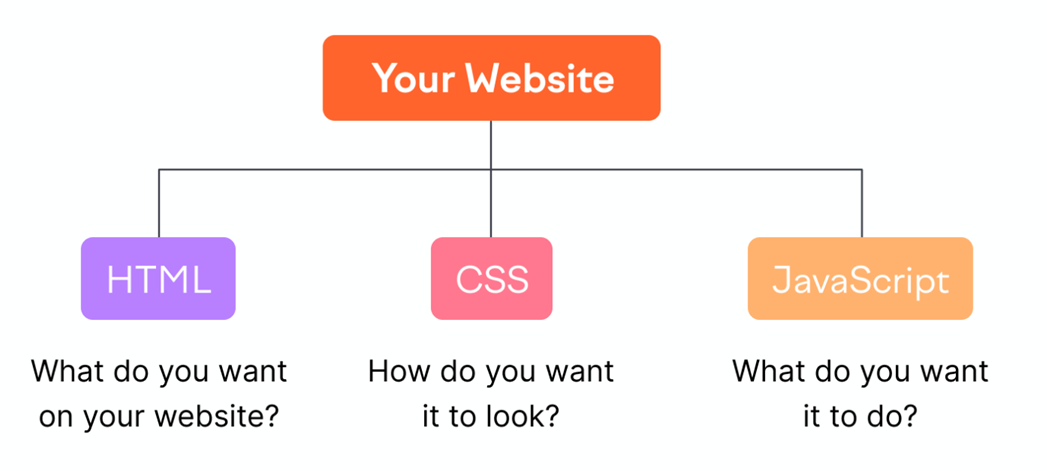
When you’re getting started with web design, a key element to making everything work properly and look the way you need it to look falls in the hands of CSS. That’s an abbreviation for Cascading Style Sheets, and they allow you to style HTML elements in any way you want.
And even though you could experiment with CSS in any number of ways—most often inline—there is a better way to go about it. That falls in line with a series of best practices you have to follow to ensure your code is purposeful, without unnecessary bulk, and nicely organized.
Today, we’ll highlight 18 CSS syntaxes that aspiring front-end developers have to realize, but even skilled professionals ought to brush up on the basics sometimes.
1. Ways to include CSS in the website
There are four ways that we can use CSS on any web page.
Inline CSS
In this method, we write our CSS in the style attribute of an HTML element; different rules are separated through a ; semicolon.
<p style="color: red; font-size: 16px;">This is a paragraph with inline CSS.</p>Internal CSS
In this method, we write our CSS below the <style> tag. which falls inside the <head> tag.
     <head>
       <style>
         p { color: blue; font-size: 18px; }
       </style>
     </head>
     <body>
       <p>This is a paragraph with internal CSS.</p>
     </body>
External CSS
In this method, we write CSS in an external file. The document has an extension '.css'. And we include the CSS file using the <link> tag beneath the <head> tag.
HTML
<head>
    <link rel="stylesheet" type="text/" href="styles.css">
</head>
styles.css
p { color: green; font-size: 20px; }
Using @Import
In this method, we add CSS by using the @import keyword. This kind of import only works inside style tags.
HTML
     <head>
       <style>
         @import url("styles.css");
       </style>
     </head>
The advantage of this rule is that we can include media-dependent CSS conditionally.
2. Which CSS has the highest precedence?
This isn't syntax, but something that everyone should know. So there are four ways to use CSS. And if we follow the CSS Rule in all four ways, which CSS rule will be implemented?
This is the priority order:
inline css > internal css > external css > @import
Inline CSS has the highest precedence. After this, internal followed by external, and @import.
3. Use of !important
What this property means is that if you use it with any property, it will make sure no other CSS rules can override it. No matter where you write your CSS to override it, regardless of which specificity selector you use, it can’t be overridden. Use it with caution.
p { color: purple !important; }4. CSS Position Property
This is the most important and widely used property. You have to understand it completely.
The following are the possible values for function property:
static: By default, every element is static. The top, left, bottom, and right properties don't work on any element until we assign every other property other than static.
.static {
      position: static;
     }
Absolute: When we use this property, the element leaves the DOM tree and can be placed anywhere on the webpage. Once an element becomes absolute, it won’t have any effect on the layout of the website at all. It becomes a free element that can be used anywhere.
   .absolute {
     position: absolute;
     top: 50px;
     left: 50px;
   }
Positioning can be calculated from the nearest parent having a position relative; if it isn't a parent with a position relative, the position will be calculated from the body tag.
Relative: Once we apply this property, we will move the elements by using top, left, back, and right. The element can be moved with respect to its current position.
.relative {
      position: relative;
      top: 20px;
      left: 20px;
     }
Fixed: This property makes the elements fixed in any given position. means that with a scroll, the element won’t move. The top, left, back, and right positions could be calculated with respect to the body tag.
.fixed {
      position: fixed;
      top: 10px;
      left: 10px;
    }
Sticky: This property works exactly as fixed, with one difference, i.e., we can make an element act fixed once it reaches a particular position.
For example, if we scroll the web page and the element reaches 100 pixels from the top and we want to stay there, we will use sticky.
.sticky {
      position: sticky;
      top: 0;
    }
5. Display Property
This is one of the most vital properties of CSS. There is more than one usage of the display property.
1. To convert inline elements to block, flex, and vice versa.
2. To remove an element from a DOM tree. In other words, making it non-existent so that the element won’t take up any space available.
3. To control the layout (grid, flex, or table cell)
display:none //to take away element from dom
show:block // conversion of inline to block
display:flex | grid// to control the layout flow
6. Z-Index
We use this property to manage the stack of views. A view with a higher value could be at the top and could cover the views with a lower z-index. We especially use it for pop-up menus and dialog boxes, as they show on top of any other HTML element.
   .popup {
     position: absolute;
     z-index: 2;
   }
7. Overflow
As the name suggests, we use this property to govern the behavior of an element when the content is large and not able to fit in a container. We can either add a scroll or cover the overflowing content.
We can manipulate the horizontal and vertical overflow behaviors separately.
overflow:vehicle // provides a scroll bar whenever the content height is bigger than the container (shorthand for both x and y)
overflow:hidden // will hide the overflowing container. (Shorthand for both x and y)
overflow-x and overflow-y control every side scroll separately.
8. Box-Model
This is one of the most important syntaxes in CSS. One must understand how the box model works in CSS. Basically, the box model is nothing but a combination of three properties: padding, margin, and border.
   .box {
     padding: 10px;
     margin: 5px;
     border: 1px solid #000;
   }
9. Background
There are many uses for the background property.
1. Adding background color to any HTML element
2. Adding photos as a background to any HTML element
   .colored-background {
     background-color: #f0f0f0;
   }
10. Cursor
    .pointer {
      cursor: pointer;
    }
11. Pointer-events
There is more than one usage of this property. We can use these properties based on what the situation is:
Situation 1: When we want to disable clicks on elements. However, we should additionally obtain disability using JS. If we apply pointer-events:none to any element, that element will no longer be clickable.
Situation 2: When we want a transparent background or element above any visible content. But we need our click to penetrate through the transparent view.
We can add pointer-events:none to have click-through functionality.
    .non-clickable {
      pointer-events: none;
    }
12. Any Layout Management Property
Almost every website follows a layout, either a column, row, or grid layout. One should know at least one way to control the designs on a website. In the past, we used to manage the layout by using floats; however, now flex and grids are the two most popular ways of managing the layout.
    .flex-layout {
      display: flex;
      justify-content: space-between;
    }
13. Pseudo Classes
Using CSS properties, we can display different states of an HTML element. By state, this is how we're interacting with the HTML element and what its current state is. For instance, is the element in a focused state, or are we hovering over the element?
A few common pseudo-classes are:
hover, visited, focus
We can apply these pseudo-classes using a colon after the CSS selector.
    a:hover {
      color: orange;
    }
14. Pseudo-Elements
Just like pseudo-classes, we have pseudo-elements. Using this, we can beautify an HTML element to a certain extent without the use of additional tags.
Syntax: Add a double-colon after the CSS selector to add CSS to pseudo-elements.
Usage: For example, to make the first line of any element stand out, we will add a custom style to the first letter of any HTML element without wrapping it in a span.
    p::first-line {
      font-weight: bold;
    }
15. Border
As the name suggests, this property adds a visible border to any element.
  .bordered {
      border: 1px solid #ccc;
    }
16. Border Radius
We use this property to add rounded corners to any HTML element.
 .rounded {
      border-radius: 10px;
    }
17. Opacity
As it is clear from its name, this property is used to control the visibility of any element. Its value ranges from 0 to 1. By default, every element has an opacity of one. Opacity 0 means the element is not visible at all but will still take up space within the DOM.
Few Usages of Opacity:
1. To give a semi-transparent look. Generally, you see this behavior in dialog boxes.
2. in fade-in and fade-out animation. Generally, we use opacity to create this lovely impact.
    .semi-transparent {
      opacity: 0.7;
    }
18. Box-sizing
This property controls how the size of the HTML element is affected when we apply padding and bordering to it. By default, padding and border length don’t contribute to the size of an HTML element. The result will be a larger length of element as per the given height and width.
For instance, if we have a div of 100 pixels, and if we apply padding left and right at 20px and a border of 4px, then the dimensions of the div will become 148px. padding will be added to the box. But if we want the padding and border to be 100px, then we can use box-sizing:border-box.
   .box-sizing {
      box-sizing: border-box;
      width: 100px;
      padding: 10px;
      border: 2px solid #000;
    }
Conclusion
Aesthetics, styling, and responsiveness of a website form an essential part of attracting visitors to the site in today's day and age, in which the attention span of the target market is very confined. CSS (Cascading Style Sheets) is a critical tool that every web developer ought to equip themselves with, as it offers us the capability to easily play with beautiful results and responsive designs. Another advantage is that it is easy to learn once you are familiar with the primary concepts. These are the 18 important syntaxes each CSS developer must know to make notable front-end web designs.
How much is a great User Experience worth to you?
Browsee helps you understand your user's behaviour on your site. It's the next best thing to talking to them.

