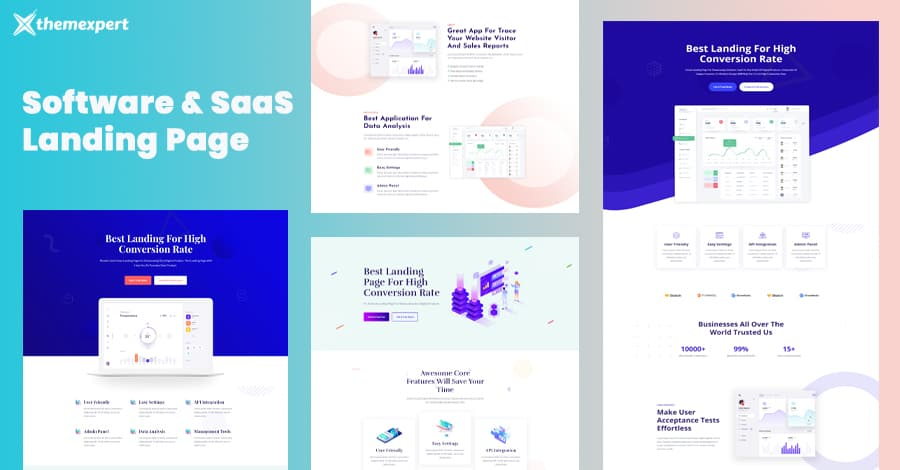
25 Top Saas Landing Pages And Why They Work
Your landing page is where you make or break your business when it comes to conversion. The platform for showcasing how great your product is, is a landing page, but how do you know which ones are effective? Scroll down to find ideas for your next landing page and effective conversion-boosting tactics. Here are 25 incredible SaaS landing page examples for 2023. Are you getting the conversions you need from your landing pages?
What Is A SaaS Landing Page?
Let's start by defining what a landing page is and isn't. A landing page is not your home page, to begin with. Your website's home page should provide a thorough overview of everything your company does and act as a link to all other pages on the site.
On the other hand, landing pages are solitary web pages created with a particular objective in mind, such as promoting an offer or campaign, gathering leads, or selling products. They give site visitors more thorough information than is typically available on the homepage. Landing pages can effectively achieve desired results by including elements that compel visitors to take action.
What Should Be On A SaaS Landing Page?
A few components are practically universal in the world of landing pages. Others are more specifically applicable to SaaS companies. Your SaaS landing page might be missing essential components in terms of content, user experience, or conversion potential without these prerequisites, though.
- Attention-Grabbing Headline: Your SaaS landing page is the first point of contact, so make the most of it.
- CTA Button: Clicking the CTA button initiates the conversion process, so it needs to be alluring.
- Copy: Your landing page's copy should only contain words that will increase conversions. While highlighting the advantages is always a good idea, describing the benefits of the features also has value.
- Sectionalisation: Having distinct visual markers indicating where one section ends and another begins increases overall legibility and makes the landing page easier to read.
- Unique Selling Point: Show your audience your SaaS company's unique selling proposition to make it stand out.
- Visuals: Pictures, icons, videos, and animations; all of these components can aid customers in understanding your product's purpose and forging positive associations with it.
- Forms: The primary purposes of forms are to schedule meetings for demos or to collect phone numbers and email addresses. Generally speaking, it is best only to have one form because you want to make sure the user is clear and in a difficult situation.
- Testimonials: A customer's endorsement of your good or service speaks volumes about its calibre.
Along with the essential components, you should also consider some best practices for SaaS landing pages, such as promoting free trials and avoiding using too much technical jargon.
25 Examples of SaaS Landing Pages
25 landing page examples are provided below, along with information on how these SaaS companies use them to advertise their products, get leads, encourage the download of lead magnets, and more.
We will also discuss the positive aspects of each example page and areas that could be enhanced to boost conversion rates. The most important thing is that you will be motivated to develop your landing pages following best practices.
Hiver
Highlights
- The product's unique selling proposition is discussed in the hero copy, which is brief and to the point.
- The logos of well-known companies that chose Hiver are also included in the hero section and serve as excellent social proof.
Why it works
Hiver's landing page makes excellent use of visuals, which are a powerful tool for explaining the features of your product. The features section's screenshots serve as a fantastic product demo.
Tips for improvement
The design seems a little unfinished, particularly the "more features" section, which stands out so much from the rest of the landing page. The low-key nature of that section makes the content there invisible. On the page, the form could have been positioned much higher.
Talon.One
Highlights
- Effortless design and reliable branding
- Quickly presented, multi-step form
Why it works
The landing page's design is simple but contemporary and upholds consistent branding. The page is suitable for smaller screens and is mobile-friendly.
Tips for improvement
A more alluring copy could be added since the content is lacking. The lengthy form could be reduced to encourage more signups (by lowering friction).
AppsFlyer
Highlights
- A compact form with only four fields to complete.
- A simple design provides the user with all the information they require in less than a minute.
Why it works
Showing off reputable clients gives visitors confidence by implying that the tool has been tried and tested. The landing page's content is simple to read and comprehend, so it does not take long to absorb everything.
Tips for improvement
It is too short. Except for the headers and the testimonial, there is no copy to speak of. The tool is not mentioned at all. To make the landing page more inviting and accessible, at least a few sections are missing.
Readymag
Highlights
- An inventive animated demo effectively highlights the capabilities of the product.
- Sections that are clearly defined and give good details about the product's features.
Why it works
The landing page for Readymag makes extensive use of complex animation and transitions. The real-world examples add a nice touch as well.
Tips for improvement
This is less of a landing page and more of an art installation. The design largely obscures the copy on this page, making it challenging to read. Too much is happening. The CTA button and the form for signing up for the newsletter are barely visible.
Cloudtalk
Highlights
- Offers an ebook as an incentive to users to sign up
- Gives readers a reason to click the sign-up button by emphasising the advantages of the ebook.
Why it works
The landing page for Cloudtalk is quick and to the point. It is direct and includes a brief section briefly describing what the readers will learn from the ebook.
Tips for improvement
Contrary to the best practices previously mentioned, the landing page has two forms. Requesting a phone number in exchange for an ebook download makes little sense. An ebook might not seem like a compelling enough incentive to give up their phone number from the user's point of view.
HiPeople
Highlights
- Excellent hero copy. It draws attention while briefly stating the advantages of using the product.
- Due to its straightforward design, the page loads quickly, and the majority of the content is brief and pertinent.
Why it works
There are only two buttons in the body of this SaaS landing page: one leads to a demo form, and the other directs users to a free trial page. The page explains the tool's benefits quickly.
Tips for improvement
Due to the hero section's cutoff on smaller screens, it must be responsive. On the landing page, there is only one testimonial; adding a few more in a slider would have a more significant impact. The form might even be made shorter. It is excessive to ask for an email address and a phone number.
Barco
Highlights
- Creates and nurtures leads using a gated guide to pique their interest in purchasing remote/hybrid collaboration tools.
- The landing page is brief and light, which helps it load quickly.
Why it works
Visitors get a thorough explanation of the guide so they know exactly what to expect. Due to the landing page's brief and light design, it loads quickly.
Tips for improvement
The style is very plain. There are few images, many words, and a white background. It has no impact other than the red font that is used occasionally.
The form also asks users to fill in fields for their company name and country in addition to their name and email address.
Zoho CRM
Highlight
- A striking design appears in the hero section, and then, below it, are the logos of their top clients.
- In addition to top clients' striking designs and logos, Zoho CRM leverages testimonials from satisfied clients to further highlight its credibility and effectiveness.
Why it works
The landing page for Zoho CRM checks all the right boxes. Users have many reasons to choose Zoho CRM, including excellent hero copy, a striking yet fluid design, a social proof section with logos of well-known clients, and even a thorough comparison table.
Tips for improvement
Due to the large number of animations, the page took longer to load on mobile devices. Additionally, adding one more CTA button to the page's middle would have served as a helpful reminder to sign up.
Locobuzz
Highlights
- Excellent hero copy encourages readers to sign up for Locobuzz to grow their business.
- Having a straightforward yet elegant design, the landing page can be quickly skimmed.
Why it works
The landing page for Locobuzz only has two CTAs. One forms your basic information, while the other schedules a call with their team. Their clients' logos, including Sony and Audi, serve as social proof in this case. That alone encourages prospective customers' confidence.
Tips for improvement
The content needs to be more lustre and says little about the product itself. This landing page does not educate a visitor who does not know what Locobuzz does.
ImageKit
Highlights
- Keeps the copy length brief while saying a lot about the product.
- A good use of visual design to draw attention to the product's features.
Why it works
ImageKit's landing page aims to convince users to sign up for the service by providing compelling arguments. And it gives it in an aesthetically pleasing and obvious way. The social proof section follows the hero section and includes reviews from review websites and the logos of well-known clients.
Tips for improvement
The hero section itself is uninteresting. There needs to be more visual imagery or persuasive copy to persuade users to scroll down unless they are interested.
SurveySparrow
Highlights
- An animated product demo immediately captures the visitor's attention with the hero.
- The mobile version makes good use of white space to draw attention to customer logos.
Why it works
Some elements that make SurveySparrow's landing page effective include a hero section that jumps right into product functionality, clever use of exit pop-ups to prompt users to sign up, and providing as much information as possible without overcrowding the landing page with content.
Tips for improvement
Due to the extensive use of white space, the landing page appears a little sparse in some areas on larger screens, such as laptops. It would have been helpful if larger screen optimisation had been done.
Lusha
Highlights
- The hero's vivid imagery immediately captures the user's attention.
- Animations as an excellent way to show off a product's capabilities.
Why it works
Lusha's landing page has much to recommend, starting with the hero copy and continuing with the section listing certifications. The cherry on top is that the CTA buttons are consistently visible at the top of the page as you scroll down.
Tips for improvement
The testimonials section appears to be a little underwhelming, and the claims of an 800% increase in sales seem much less credible, especially without context.
Jira
Highlights
- The copy on the landing page is concise throughout but effectively conveys the message.
- Due to its simple design, the landing page loads incredibly quickly on mobile devices.
Why it works
The landing page for Jira loads quickly, has a clear but informative copy, and is well-suited for both desktop and mobile devices.
Tips for improvement
The product screenshots should appear better on mobile devices. They are not very helpful in describing the product unless you zoom in. Jira is used by organisations like Spotify, eBay, and Cisco; a missed opportunity would be to highlight them immediately below the hero.
WebEngage
Highlights
- Clear copy, a succinct product description, and social proof in the form of customer logos and review site ratings are all present in the hero section.
- WebEngage incorporates interactive and engaging elements on its landing page to capture and hold visitors' attention. These elements may include animated visuals, interactive sliders or carousels, and dynamic content that responds to user actions.
Why it works
The landing page effectively uses sections and visual imagery to provide users with the required information without overburdening them.
Tips for improvement
Mobile optimisation. The section elements are poorly resized for mobile; the page is lengthy and clumsy and loads slowly.
Builder.ai
Highlights
- The hero emphasises the product's USP, the partnership with Microsoft.
- Builder.ai highlights transparent pricing information on its landing page, giving potential customers clarity and confidence in its pricing structure.
Why it works
The "how it works" section assists in demonstrating how simple Builder.ai is to use. The landing page has a lot of content, but it is organised well on mobile, making it appear less comprehensive.
Ways to improve
The product could be demonstrated in an animated demo or video on the page. Additionally, the testimonial section's design does little to emphasise the message.
TrainerCentral
Highlights
- The copy and product description use the fewest words possible to convey the user's accomplishments.
- An animated product demo gives users a better understand the features, capabilities, and user interface.
Why it works
The landing page for TrainerCentral is an excellent copy. Instead of just discussing the features, they emphasise the advantages the user will experience when using the product. Instead of trying to draw attention to itself, the design attempts to highlight the content.
Tips for improvement
The absence of testimonials is a huge oversight and inconsistent with best landing page practices. It would be great if some social proof supported the promises made.
Express VPN
Highlights
- The 30-day money-back guarantee demonstrates the firm's faith in its goods.
- An excellent visual representation of the service's features is the map showing the locations of the servers around the globe.
Why it works
The copy on Express VPN's landing page includes phrases like "blazing fast speeds," "secure worldwide access," and "multi-platform support" that a potential VPN user might want to hear.
Tips for improvement
The section on social proof should have been located higher on the page. It requires a lot of scrolling on mobile devices to get there.
MessageBird
Highlights
- Name-drops clients like Google, Adobe, Uber, Facebook, etc., to great effect when using social proof.
- The landing page on this list with the best mobile optimisation is concise, short, and avoids needless scrolling, and short.
Why it works
The landing page uses a few words to convey the intended message. Without extraneous distractions, the product and the social proof are the main points of interest. Which, in this instance, results in a compelling argument.
Tips for improvement
A significant drawback is the lack of information. Additional customer reviews might have been beneficial.
Connecteam
Highlights
- Connecteam does not hold back in its hero section and takes on rival Slack head-on.
- The two tools are side-by-side in a comparison table, focusing on Connecteam's advantages over Slack.
Why it works
The copy on Connecteam's landing page effectively combines bullet points and standard sentences. Four benefits are provided right away in the hero section. Since the comparison table can be expanded, it will not take up room when no one uses it.
Tips for improvement
There are some inconsistencies in the messages. Connecteam is listed in the comparison table as costing $39 for up to 50 users, but the following section states that it is free for life for the same number of users. Although having several CTA buttons on a landing page is a good idea, including them in almost every section seems excessive.
Airtable
Highlights
- The animated product demo does an excellent job explaining the functionality without using many words.
- Airtable showcases customer success stories on their landing page, featuring real-world examples of how their product has helped businesses and organisations achieve their goals.
Why it works
The description and hero copy are appealing and concisely and clearly explain the advantages of using the product. When TIME, Buzzfeed, and Netflix are your clients, you want to showcase them as effectively as possible, and this landing page does just that.
Tips for improvement
More CTA buttons scattered across the page would have been beneficial. With loading times much slower than on desktop, mobile optimisation leaves much to be desired.
Canva
Highlights
- A hero section with stellar copy and a compelling product description.
- The landing page uses white space to draw attention to the animations' colourful bursts.
Why it works
Exceptional copy and great design work together to help the user quickly grasp the essence of the product. The fact that Canva has over 100 million active users serves as social proof in this case.
Semrush
Highlights
- After each feature's description are some cleverly incorporated CTA buttons.
- A section highlighting SEMRUSH Social's value to various customer types
Why it works
This landing page's hero copy captures the user's attention immediately, and numerous strategically placed CTA buttons blend in with the copy while still standing out. The design has not changed much to make scrolling easier on mobile devices, but the optimisation is excellent.
Tips for improvement
Although the testimonial section is designed to scroll automatically, none of the devices and browsers we tested it on showed this behaviour. The hero section's visual imagery strikes me as unnecessary and a little perplexing.
Vfairs
Highlights
- The FAQ section is important because the product is built on a relatively new idea.
- The Black Friday offer of 15% off with a countdown timer brings a sense of urgency.
Why it works
Clearly explains the idea of a virtual fair and how vFAIRS can assist you in putting one together. The testimonials section further increases Potential customers' confidence, which serves its purpose.
Tips for improvement
A CTA button at the bottom is still necessary. A video demonstration of what a convincing argument in a virtual fair would look like would have been beneficial.
Jasper
Highlights
- A key feature of this landing page is a tastefully produced short overview video that walks through the product and its functionality.
- Another highlight of Jasper's landing page is the prominently displayed customer testimonials, providing social proof and showcasing the positive experiences and results that users have achieved with the product.
Why it works
Unquestionably the most eye-catching design on this list. To persuade visitors (only applies to the web version), the page makes excellent use of animations throughout and includes numerous customer testimonials. And yes, the copy is also perfect (did Jasper's AI write them? We'll never know).
Tips for improvement
Even though the design is excellent on a laptop, it takes forever to scroll to the bottom on a mobile device. Since more than half comprises testimonials, condensing it for mobile devices would have been beneficial.
Workstatus
Highlights
- On this landing page's hero section, reviews from software review websites like Capterra and Trustpilot are prominently displayed.
- Effective use of screenshots for visuals.
Why it works
The choice to emphasise social proof right in the hero copy results in a highly persuasive argument. Building trust and confidence by including reviews from websites like Capterra and Trustpilot and their logos. As you scroll down, you will see additional social proof in the form of client testimonials.
Tips for improvement
In the features section of the mobile version, there are no screenshots. Although this was done to make the landing page easier to scroll through, a video or other addition might have helped make up for it.
Conclusion
You should have no trouble getting potential customers to click the desired button as long as your landing page features social proof, crystal-clear CTA buttons, and a SaaS product that is worthwhile using. Just keep in mind that conversion is just a process. Even the most effective SaaS landing page will not be able to convince every prospective customer to sign up right away. All you can do is keep refining your SaaS website's copy and overall layout until you convert visitors into paying clients.
How much is a great User Experience worth to you?
Browsee helps you understand your user's behaviour on your site. It's the next best thing to talking to them.

