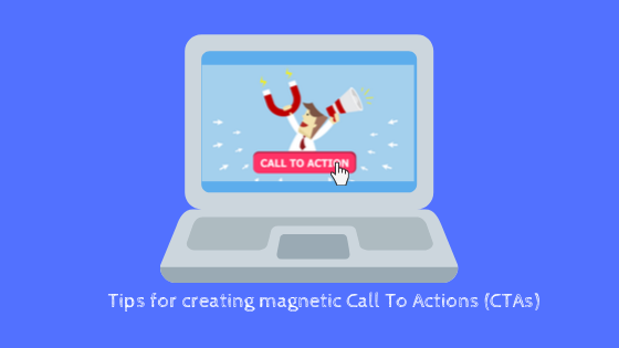
10 Tips To Create Magnetic And Effective Call To Actions (CTAs)
A persuasive call to action is the key to encourage users to increase website conversions. Here is a list of top 10 tips to create effective Call To Actions.
Are you designing a new website for your business or trying hard to convert more of your website visitors to customers? Wondering why users visiting your website abandon without performing any action? Well, if your users are not making it to your intended action page, it may be time to revisit your 'Call to Action'. How can you persuade readers to do what you intend from them? The answer is a magnetic 'Call to Action (CTA).
Once you have your website set up- be it a business website or even a personal blog, you would definitely want your visitors to perform some action - like buying your product or service, signing up for something, watch a demo of your product, sharing or commenting on your blog article and much more. The key to encouraging your users to perform the desired action is including a persuasive call to action which triggers them to act immediately. In this blog, we discuss some tips on creating effective and compelling Call To Actions to bring to optimize your website conversion.
What is a Call to Action?
Call to action is one term that is emphasized much in MBA classes and in the world of marketing. A call to action is simply an instruction to the audience to respond. Technically, a call to action can be on any marketing material such as brochures, flyers, your website or landing page or an email you send to your customers as part of a marketing campaign. But here we focus on call to actions on websites/landing pages mainly.
A call to action simply urges your readers or visitors to do something at once and informs them of the steps to be followed next- maybe signup, submit an email address, or contact via phone or email, downloading an e-book, start a free trial, Subscribe to your blog or even leave a comment for your blog or anything under the sun you want your visitors to do.
What do you think can persuade your users to click your call to action and perform the desired action? A beautiful design that stands out and amazing copy? Yes, of course, it matters. But there are even more things you should seriously consider while including Call to actions (CTAs). You need to focus more on making your call to action more compelling and powerful enough to persuade or influence your readers. The more influential your CTA is, the more clicks you get Let’s dig into the secrets of creating compelling and magnetic CTAs.
How to create CTAs that give you more clicks?
Here is a list of top 10 tips to consider while creating your CTAs.
1.Be direct and indicate a specific action.
Be precise and make it clear to the customer what action is expected from them. It should be as specific as possible. Make sure there is no room for any confusion and make the visitor clueless about the action to be done and how it can be done.
2. Use copy that provokes emotions and excites the reader.
Persuading the customer by provoking their emotions and making them excited about the results is not a new technique in marketing. For example, ‘Buy now at 50% off’ is a call to action that tempts the users to buy it. Who doesn’t want to buy something at half price?
3. Create urgency
Creating a sense of urgency in your call to action is proved to increase conversions. On the user’s side, fear of missing out on an opportunity is a great motivation to take action immediately. Phrases like “Buy Today. Limited stock!”, or “Sign up immediately for a free trial” works well in creating a sense of urgency in users. Convince them that delaying might result in missing an opportunity. Words like “Today’, “Now” and “Immediately” works well and are sure to get you some additional clicks.
4. Use copy that tells your readers ‘what’s in it for the user?’
Your CTA copy should convince people of how it can be beneficial to them. It should drive them to take the desired action. If the message focuses on what readers are going to get out of doing the action, there is a good chance of converting the users. Just try something in a softer tone that will tell them why they need the product, rather than just telling “Buy it”. For example, on a landing for downloading an eBook on weight loss. Rather than saying “Download”, say something like “Show me how to lose 5 pounds in a week”.
5. Use powerful words in your CTA
While including CTAs, it’s logical to understand human psychology a bit.Not too much of psychology, but at least some common traits all of us have. All of us are lazy, greedy, frugal, want to look good, become richer, find solutions easily and so on. Aren’t we? Maybe not everyone, but the majority of us are. Once you realize this, you can create better CTAs.
Use powerful words that appeal to these characteristics of human nature. Emphasize words that convey quick results for lazy people- say something like quickly, easily, effortlessly, etc or words like free, at low cost, no cost, inexpensive, just, etc to appeal to frugal minds. These kinds of words are really powerful enough to attract people and get some conversions.
6. Use numbers whenever possible.
In general, people respond well to numbers. If you include numbers like pricing in your CTA, it in fact makes the action very specific for users. Numbers give the users a concrete idea of how worth it is. “Shop for furniture under $100”, “Lose 5 pounds in 1 week”, “Sign up today for a 1-month free trial”, Buy today at 15% off” are some examples that can potentially attract some clicks.
7. Make your ‘Call to action’ look simple and seamless.
The action to be done should look seamless to the user. Tell your reader that the action is not time-consuming or costly. Of course, all of us like to get things done quickly and easily. For example, a CTA saying “Sign up for free in less than a minute” looks more persuasive to the reader. The action is both free and it takes just a minute to do. Then why not try?
8. Choose your ‘CTA’ locations wisely.
Placing your CTAs in locations that get more attention is a critical aspect of getting more conversions. The readers should never miss your CTA. When people visit your site, generally they start reading in a horizontal movement above the fold. Upon arrival, the user should immediately find your CTA button. In fact, its always not necessary to do this as well. There can be different approaches based on your page content and design.
Ideally, you should position your CTA where it will influence the decision-making process of your prospects. If the offer is a simple one that uesr knows about already or can understand easily and pretty direct, above the fold is a good approach.
Moving a CTA all the way to the bottom of the page works well too if you have interesting content and is sure the user will scroll till bottom. If the content of your page is such that users has to read the content and digest your information to make a decision, this is a good option. And in fact, the majority of users do scroll down till the last section of your page if you have compelling content or valuable information. In this case, a CTA above the fold is likely to be missed unless the user goes back looking for it.
Closer to your cover photo or right below the headline are other areas that people usually notice.
Having more than one CTA is another option so that your CTA never goes unnoticed. You can very well have a ‘Contact us’ button above the fold and bottom of the page.
9. Select colors wisely.
Selecting Contrasting colors for your CTA button and the CTA copy is essential to make your CTA stand out on your page. Contrasting colors can help you draw the reader’s attention to your CTA.
10. Your CTA should always look clickable.
Make sure you make your Call to Actions clickable. It can be a clickable button or a link. In case of a button, make it look like a clickable button (a 3-d effect is appreciated) and links should be ideally the standard link-blue color, if not at least underlined.
Pro tip: With all these tips, sure you can come up with effective CTAs. But, understand CTAs are not one size fits all. A CTA that could have brought tremendous conversions for a website might not work for you because your business nature is different, your website content is different, your audience are different and so on. So the only way to know what best works for you is Test! Test! Test!. Do A/B testing using tools like Optimizely to try different CTAs, positions and so on and decide what works best. Use heat maps to know where users are clicking and upto which point they are scrolling, which area of the page users spend more time an so on. All these will help you identify which sections of your page get more attention and can help with CTA placement.
Browsee offers tools including session replays, heat maps (click and scroll maps) and Attention maps that can help you identify your CTA sweet spot. See more features here.
I hope the article helps you create CTAs that bring more clicks and increase conversions. All the best!
How much is a great User Experience worth to you?
Browsee helps you understand your user's behaviour on your site. It's the next best thing to talking to them.

