Tailwind's Catalyst Ul kit for React user interface development
Do you prepare to change the method of making user interfaces in React by using Tailwind CSS? We start with Catalyst v0.1.0; this is a new creation from the people who made Tailwind CSS. This is more than just a usual UI kit; it represents a big change in the way components are designed and customized.
What is Tailwind CSS Catalyst?
Catalyst is a current UI kit for applications, made with Tailwind CSS, Headless UI, and React. The team behind Tailwind CSS created it. It offers a set of attractive UI components ready for use in your projects. You can integrate these with the code you write yourself and modify it to fit your preferences.
Avoid spending time creating buttons, form controls, pop-up dialogs, tables, and drop-down menus yourself. Start working quickly with component APIs that are designed for easy use.
Why Catalyst?
Imagine you are creating a new technological marvel, something that can compete with big names like Stripe or Linear. You wish for an interface that is not only practical but also stunningly attractive. Catalyst is the solution you should consider. When using this UI kit, it's more than just components; it’s about creating an experience. It is created for groups that value design, wish to have control over their user interface elements, and are not satisfied with just any ready-made library.
Key Features of Catalyst
Fully-Componentized Architecture: Each part of the Catalyst architecture is made to fit well with others, providing a seamless experience in building software.
A Disappearing UI Kit: The most impressive thing about Catalyst is that after half a year, when you see your work again, it will surprise you how well Catalyst has integrated itself. It feels like each part was made by hand from the beginning.
Design that Communicates a Lot: In Catalyst, every single pixel is important. The slight blurring behind drop-down menus and the smart use of moving images show how much care went into the design details.
Made for better performance: The parts look good and help you work faster. The user interface has lots of details but is still clear to see.
Dark Mode and Beyond: Catalyst smoothly integrates dark mode, adjusting its parts to provide an optimal experience in light and dark environments.
Constructed by specialists: You can be confident that the code adheres to Tailwind CSS's top guidelines since it comes from the same group that developed and continues to look after the framework.
Simple to make changes: All is designed using utility classes, right in the component code. There is no need for setting up variables or dealing with complicated CSS; simply edit any part of a component you wish directly within your editor.
Made using React: This is a collection of well-organized and smartly created components. They are crafted by specialists with much experience in React. Take advantage of the power and established nature of the React environment.
Keyboard accessible: Everything we create can be used with a keyboard, and we put much effort into designing the code to provide an excellent experience for screenreader users.
TypeScript or JavaScript: It is written with the newest TypeScript version by enthusiasts who really enjoy perfecting the types to provide an excellent experience for developers. There is also a simple JavaScript variant provided if TypeScript does not suit you.
Who is Catalyst For?

Catalyst is tailor-made for developers who are:
- Passionate about creating stunning, functional UIs with React.
- Familiar with Tailwind CSS and its utility-first approach.
- Keen on building a custom component library that’s both flexible and scalable.
If you are working on a project, no matter its size, from small to large, Catalyst offers the essential parts for making a user interface that is unique to your own style.
Getting Started with Catalyst
First, confirm that there is a Tailwind CSS project ready for you to use with Catalyst. Although Catalyst uses React, it does not require one exact framework of React and works with Next.js, Remix, Inertia or any other kind of React project.
To get assistance with making a project and setting up Tailwind CSS, please look at the guidebooks within the Tailwind CSS documentation.
Catalyst is designed using Tailwind's standard theme settings, including default space sizes, colors, shadows and others. You can change whatever you prefer; however, if you alter the standard theme a lot, it will not work as intended straight away. For your changes to fit in, editing the components will be necessary.
We will show you how to start adding this new UI kit to your React project. This section is a guide for both beginning a fresh project and improving one that already exists, leading the way for a good setup.

Prerequisites
Before we jump into the installation process, let’s make sure you have everything you need:
React Knowledge: You must have a basic grasp of React. Knowing about components, properties, and how to handle states is very important.
Development Environment: For creating code, you should have a program to write the code in, such as VSCode. Also necessary is Node.js and a package management tool like npm or yarn installed on your computer.
Tailwind CSS Setup: Catalyst is designed for an easy combination with Tailwind CSS, so confirm that your project includes it. If you are starting with Tailwind, go see the official guidelines on how to set it up.
Step 1: Downloading Catalyst
First things first, let’s get Catalyst into your project:
If you have the Tailwind UI All-Access pass, please go to your Tailwind UI account and get the new version of Catalyst.
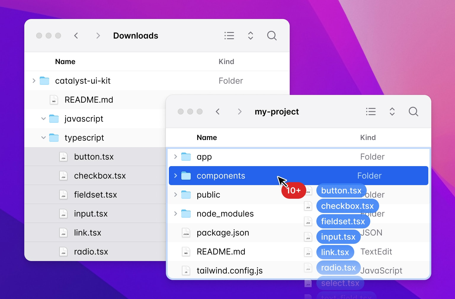
After you download, please open the file named catalyst-ui-kit.zip. Inside, you can see that components are arranged, and you can choose from JavaScript or TypeScript versions. Choose according to your project's setup.
Step 2: Integrating Catalyst Components
Include new parts in your work: Move the component documents from the Catalyst bundle to the directory where you keep components for your project.
Learn how the folders are arranged: Spend some time looking at how everything is organized and what the parts are called. Get to know how files are named and where they're placed.
Step 3: Installing Dependencies
Catalyst works hand-in-hand with a few dependencies. Let’s get them installed:
npm install @headlessui/react@next clsxPlease make sure you use the @next tag for @headlessui/react because Catalyst uses a development version of Headless UI.
Step 4: Setting Up a Client-Side Router
The Link component from Catalyst usually starts as a regular HTML <a> tag. You will probably need to combine it with the routing system of your project.
Change the file named link.tsx or link.jsx inside the Catalyst package to work with the routing library that your project uses, for example, Next.js or React Router.
Step 5: Optional Configurations
The Inter Font Family is used by Catalyst for being consistent and elegant. To add Inter to your project, please insert this line into your HTML code:
<link rel="stylesheet" href="https://rsms.me/inter/inter.css" />Then, update your tailwind.config.js to include "Inter" in your font family settings.
Heroicons Integration: For iconography, Catalyst uses Heroicons. To add them:
npm install @heroicons/reactConclusion
Catalyst UI is a strong set of components that improves upon Radix UI Primitives, using Tailwind CSS for styling. It has many features, like extra components, utility elements and hooks, support for dark mode already included, and styles you can change as needed. Catalyst UI has a simple setup and many guides; it is good for making prototypes and creating applications easily.
How much is a great User Experience worth to you?
Browsee helps you understand your user's behaviour on your site. It's the next best thing to talking to them.

