Tailwind Spinners and Waiting Animations
Creating loading spinners is a simple task with Tailwind CSS. Regardless, if you need to add an integrated animated utility class to a spinner icon or if you want to build a spinner that suits your theme, it should take a short time to set up!
Why Loading Spinners are Important
Our goal as front-end developers is to make the web fast and beautiful. Sometimes, though, things are out of our control. HTTP calls may take some time to return data, and in those conditions, it could be suitable to show a temporary element to help the user know the status of their request.
Loading spinners do that: provide an easy and temporary detail to signify a pending state. Without a loading spinner, users might imagine that their request didn't undergo processing or that the application or internet site is broken.
Using built-in CSS animations with Tailwind CSS
CSS animations is a CSS module that helps you animate the values of CSS properties through keyframes. The nature of these keyframe animations can be altered by tweaking their properties, including duration, easing function, direction, delay, and more.
Just like different CSS properties and modules, Tailwind CSS also ships with a few utility classes for CSS animations. By default, it comes with four basic animations: spin, pulse, ping, and bounce.
These utility classes are prefixed with the aid of the animate keyword, consisting of animate-spin or animate-pulse. Let’s take the animate-spin utility as an instance. This utility class is used to feature linear and endless spin animations for your HTML elements. This is especially useful for loading indicators, which include those that you would possibly discover on a button in forms.
Here's an example of a default spinner:
<div role="status">
  <svg aria-hidden="true" class="inline w-8 h-8 mr-2 text-gray-200 animate-spin dark:text-gray-600 fill-blue-600" viewBox="0 0 100 101" fill="none" xmlns="http://www.w3.org/2000/svg">
<!-- Spinner SVG code -->
  </svg>
  <span class="sr-only">Loading...</span>
</div>
In this case, the animate-spin class is used to add a linear spin animation to the SVG detail; this creates a loading effect. The w-8 and h-8 classes are used to set the width and height of the spinner, while the text-gray-200 and dark:text-gray-600 classes are used to set the color of the spinner in light and dark mode, respectively. The fill-blue-600 class is used to set the fill color of the spinner.
Customizing Tailwind CSS Spinners
You can easily customize the colors, sizes, and styles of Tailwind CSS spinners by editing the utility classes.

For example, to change the main color of the spinner, you could use the fill-{*} utility class, and to change the background color, you could use the text-{*} utility class.
<div role="status">
<svg aria-hidden="true" class="inline w-4 h-4 mr-2 text-gray-200 animate-spin dark:text-gray-600 fill-blue-600" viewBox="0 0 100 101" fill="none" xmlns="http://www.w3.org/2000/svg">
<!-- Spinner SVG code -->
</svg>
<span class="sr-only">Loading...</span>
</div>
In this situation, we have changed the dimensions of the spinner by using the w-4 and h-4 classes, and we've changed the fill color to blue-600.
Colors
You can change the colors of the spinner detail using the fill and color utility classes from Tailwind CSS:
- use fill-{*} to change the main color
- use text-{*} to change the background color
Example
<!-- Change the main color of the spinner -->
<div class="fill-red-500 spinner"></div>
<!-- Change the background color of the spinner -->
<div class="text-blue-300 spinner"></div>
Sizes
Change the scale of the spinner component using the h-{*} and w-{*} utility classes from Tailwind CSS:
<!-- Change the size of the spinner -->
<div class="h-8 w-8 spinner"></div>
Alignment
Because the spinner component is an inline HTML element, it can be aligned at the left, center, or right side easily using the corresponding utility classes.
Example
<!-- Align the spinner to the left -->
<div class="text-left spinner"></div>
<!-- Align the spinner to the center -->
<div class="text-center spinner"></div>
<!-- Align the spinner to the right -->
<div class="text-right spinner"></div>
Spinner with card
Use this animated loading indicator while the content inside a card is still loading.
Example
<div class="bg-gray-200 p-4">
<div class="fill-blue-500 spinner"></div>
<p class="text-sm text-gray-600">Loading content...</p>
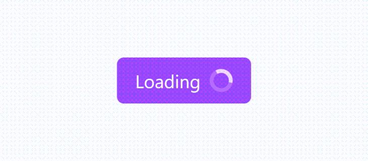
</div>Buttons
The spinner component can also be used inside elements along with buttons when submitting form data:
<button class="bg-blue-500 text-white p-2 w-24 rounded-full inline-flex items-center justify-center">
<div class="fill-white spinner"></div>
Submit
</button>
Waiting Animations
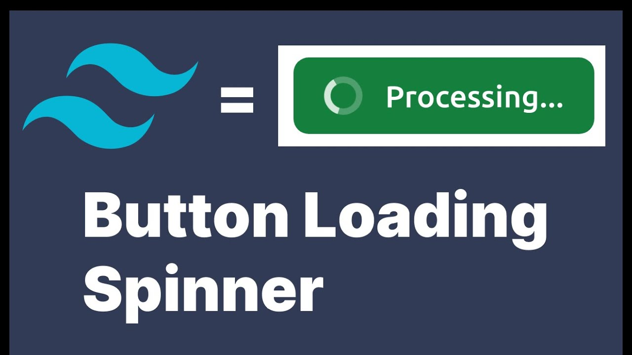
In addition to spinners, Tailwind CSS offers utility classes for different waiting animations. These animations may be used to enhance the user experience when data are being fetched from the server. Here's an example of a progress spinner:
<div role="status">
<svg class="animate-spin h-5 w-5 mr-3 ..." viewBox="0 0 24 24">
<!-- Spinner SVG code -->
</svg>
Processing...
</div>
In this case, the `animate-spin` class is used to add a linear spin animation to the SVG detail, creating a progress indicator. The `h-5` and `w-5` classes are used to set the height and width of the spinner respectively, while the ' mr-3 class is used to add a few margins to the right of the spinner. The text "Processing..." is delivered to provide loading status to the user.
Customizing Waiting Animations
You can customize waiting animations in a similar way to spinners by enhancing the utility classes. For example, you could change the animation duration, timing feature, and keyframes to create a completely unique, ready-made animation that fits your requirements.
Example
<button type="button" class="bg-indigo-500 ..." disabled>
<svg class="animate-spin-slow h-5 w-5 mr-3 ..." viewBox="0 0 24 24">
<!-- Spinner SVG code -->
</svg>
Processing...
</button>
In this situation, we have created a custom-ready animation by means of adding the `animate-spin-slow` class, which makes use of a distinct animation period and timing function. We have additionally modified the `h-5` and `w-5` classes to change the size of the spinner.
Flowbite and Tailwind CSS

Flowbite is a collection of UI elements based totally on the Tailwind CSS framework, designed and coded by Themesberg. It provides a base set of components that may be used to quickly prototype a user interface, addressing one of the negative aspects of Tailwind CSS compared to different frameworks. However, it is vital to note that the usage of Flowbite without setting up the build tools properly can also bring about useless CSS, so it is recommended to follow the proper set-up and configuration steps.
Flowbite Spinner
Once you have integrated Flowbite, you will get a fully styled spinner with the following code. All you need is the animate-spin class.
<div role="status">
    <svg aria-hidden="true" class="w-8 h-8 mr-2 text-gray-200 animate-spin dark:text-gray-600 fill-blue-600" viewBox="0 0 100 101" fill="none" xmlns="http://www.w3.org/2000/svg">
        <path d="M100 50.5908C100 78.2051 77.6142 100.591 50 100.591C22.3858 100.591 0 78.2051 0 50.5908C0 22.9766 22.3858 0.59082 50 0.59082C77.6142 0.59082 100 22.9766 100 50.5908ZM9.08144 50.5908C9.08144 73.1895 27.4013 91.5094 50 91.5094C72.5987 91.5094 90.9186 73.1895 90.9186 50.5908C90.9186 27.9921 72.5987 9.67226 50 9.67226C27.4013 9.67226 9.08144 27.9921 9.08144 50.5908Z" fill="currentColor"/>
        <path d="M93.9676 39.0409C96.393 38.4038 97.8624 35.9116 97.0079 33.5539C95.2932 28.8227 92.871 24.3692 89.8167 20.348C85.8452 15.1192 80.8826 10.7238 75.2124 7.41289C69.5422 4.10194 63.2754 1.94025 56.7698 1.05124C51.7666 0.367541 46.6976 0.446843 41.7345 1.27873C39.2613 1.69328 37.813 4.19778 38.4501 6.62326C39.0873 9.04874 41.5694 10.4717 44.0505 10.1071C47.8511 9.54855 51.7191 9.52689 55.5402 10.0491C60.8642 10.7766 65.9928 12.5457 70.6331 15.2552C75.2735 17.9648 79.3347 21.5619 82.5849 25.841C84.9175 28.9121 86.7997 32.2913 88.1811 35.8758C89.083 38.2158 91.5421 39.6781 93.9676 39.0409Z" fill="currentFill"/>
    </svg>
    <span class="sr-only">Loading...</span>
</div>
Here is the documentation for flowbite.
Conclusion
Tailwind CSS and Flowbite are powerful tools for growing responsive and visually appealing websites. Tailwind CSS offers an extensive range of utility classes that may be used to customize spinners and waiting animations, permitting you to create unique and attractive consumer opinions. Flowbite, as an alternative, gives a collection of pre-designed components that can be easily customized to satisfy your particular needs, making it a precious and useful resource for web developers who use the Tailwind CSS framework.
To see the other integrated animations in motion, it is proposed to check out the Tailwind CSS documentation. Using integrated CSS for animations is proper for tasks that already have a dedicated stylesheet associated with the markup and do not require Tailwind CSS as a dependency. By combining the flexibility of Tailwind CSS with the convenience of Flowbite, you could streamline your web development workflow and create exquisite websites in less time.
How much is a great User Experience worth to you?
Browsee helps you understand your user's behaviour on your site. It's the next best thing to talking to them.

